
Front page designs for websites or hero sections of your home page is prime real estate, but most website owners and marketers treat it like garbage.
Ideally, for maximum conversions, home pages should be built like landing pages. Front page designs for websites must convert.
Landing pages are designed with a singular goal in mind: what do you want your visitors to do?
The most important thing they should do is to signup and get on your list.
Why?
- Nobody is going to buy from you right away (if it happens, you are lucky)
- Visitors won’t even signup for your free offers right away (Industry benchmark for conversions is a mere 1.56%
- Read everything you wrote at one go and then go to your checkout page.
- Arrive at your website and bookmark your page as if you were the only one out there doing what you do.
- People have choices
- On the Internet, everyone has low attention spans.
But then, those are landing pages and that’s why they are an important part of a marketing funnel.
Home pages, however, don’t get the respect they deserve.
You call it home, and then do what?
- Have a single image that never loads
- Fill it up with garbage like sliders
- Showcase your latest blogs
- Tell the world what a huge company you are
When you build a home page like a landing page, your home page also starts working to ramp up your conversions.
Bryan Harris of VideoFruit calls a home page built like a landing page as an “Inverted Pyramid page” or as an “Upside down” page.
Call it whatever, but you should turn your home page into a landing page.
Here are 17 examples of individuals, bloggers, and companies that built front page designs or home page designs much like landing pages.
Descript
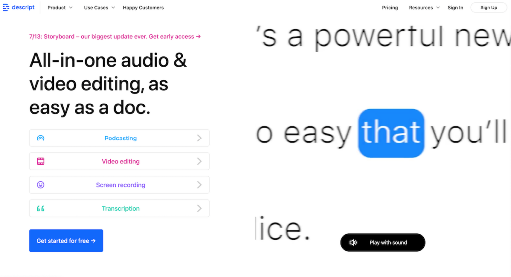
Descript is life-changing and handy tool to help you edit your videos or podcast audio — like you’d edit a word document.
You can use Descript to create screen recordings, sales prospecting videos, tutorials for Youtube, or even create complete online course videos.
Descript gives you instant video transcriptions, composition window to edit or also to repurpose other videos, and so much more.
Take a look at what Descript does with the home page — a clear heading and a well-shot video (high-production value) that drives the point home.
What will you do when you are convinced? Use the big , singular blue button to click and sign up for a Descript account to try.
Read:
11+ Descript Features That’ll Wow You
Evernote
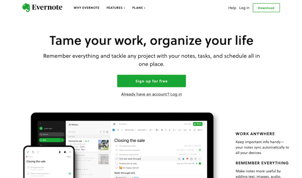
Evernote, much like DropBox and Google, was always built home page designs with the sole intent of converting visitors into users.
While Evernote still has a “freemium” way of doing business, the sheer elegance and the effectiveness with which it accomplishes what it does should be an inspiration for every business.
Period.
Podia
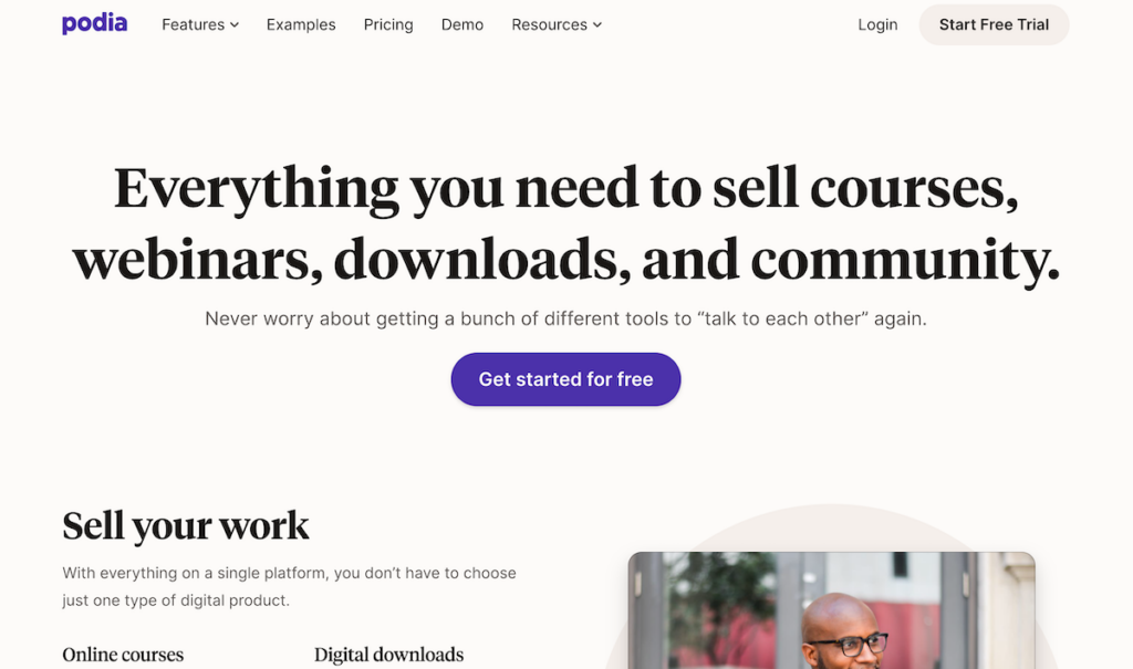
Podia might be relatively new to the “teach your online courses” platforms, but the home page just works. The white and purple combination brings elegance, sophistication, and charm to the page.
Further, notice the big button that wants you to get started for free. Irresistible.
But that’s not why it’s listed here.
It’s here because that home page is converting for Podia, and it’s kicking everyone else’s ass as you read this.
Webflow
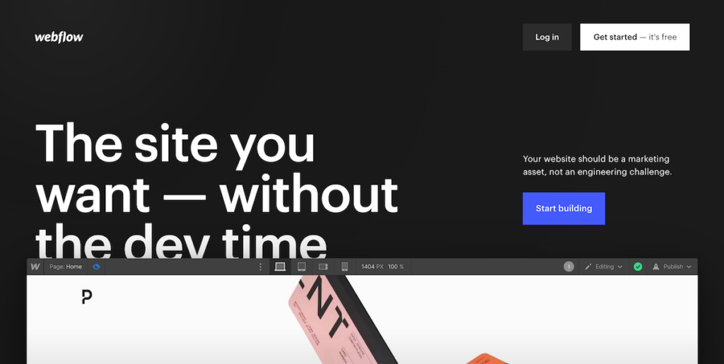
Notice how Webflow makes you take action, right at the top? Name, email, password, and signup.
That’s it.
Webflow makes everyone a designer cum developer. It’s not entirely a drag-and-drop website builder. But nor is it something for hobbyists to hack and stitch some random-looking website. Webflow brings chutzpah to HTML designs.
It boasts of fast hosting and beautiful website designs along with animations and many unique layout possibilities.
Thinkific
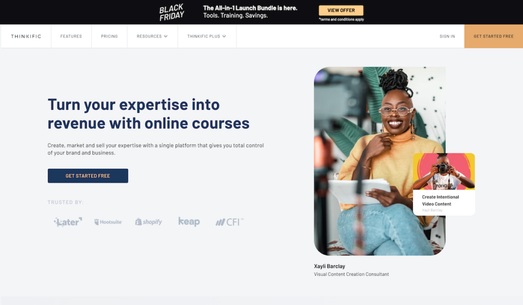
Thinkific is one of my favourite online course platforms. The home page, looks much like a landing page (minus the menu on the top). It’s slick, professional, clean, and gets right to the point.
Further, notice the banner on the top, the occasional pop-ups, and everything else that keeps this popular online courses platform going the way it’s done for a long time now.
Elementor
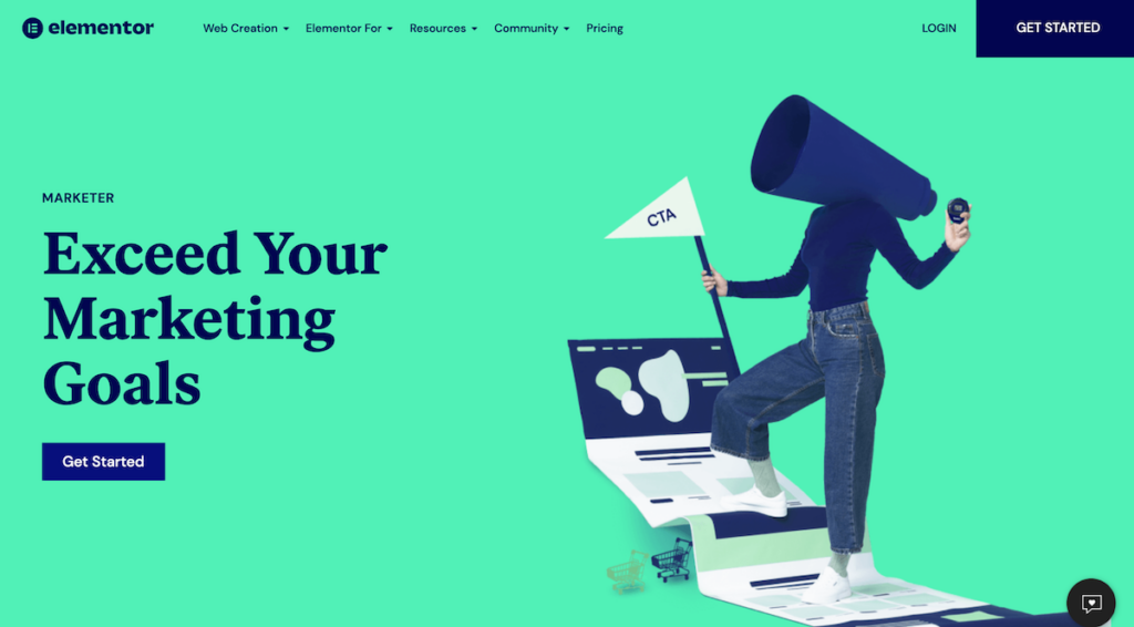
Elementor is one of the most popular WordPress builders out there, much like Divi and others. There’s been a fresh redesign of the Elementor website and the design is right the way it’s supposed to be (from a marketing standpoint).
This particular landing page is for Elementor for Marketers (a variation of their main home page). Notice the striking colors, a single call-to-action button, and absolutely clutter-free landing page like design.
Ramit Sethi (I will Teach You To Be Rich)

Ramit is a master at marketing. An author, a celebrity, and the guy who can’t bear the thought of you sacrificing your latte. His incredibly awesome content at Iwillteachyoutoberich.com he uses several design best practices to bring him what he wants: subscribers.
You just have to love his home page design for IWillTeachYouToBeRich: He puts his face up there (I wish I had a photo like that) and starts you off playfully with a quiz. I have a feeling that the quiz results are only accessible if you provide an email address.
Genius.
He also started GrowthLab – which is more like a magazine – and is an awesome read by itself.
Bench
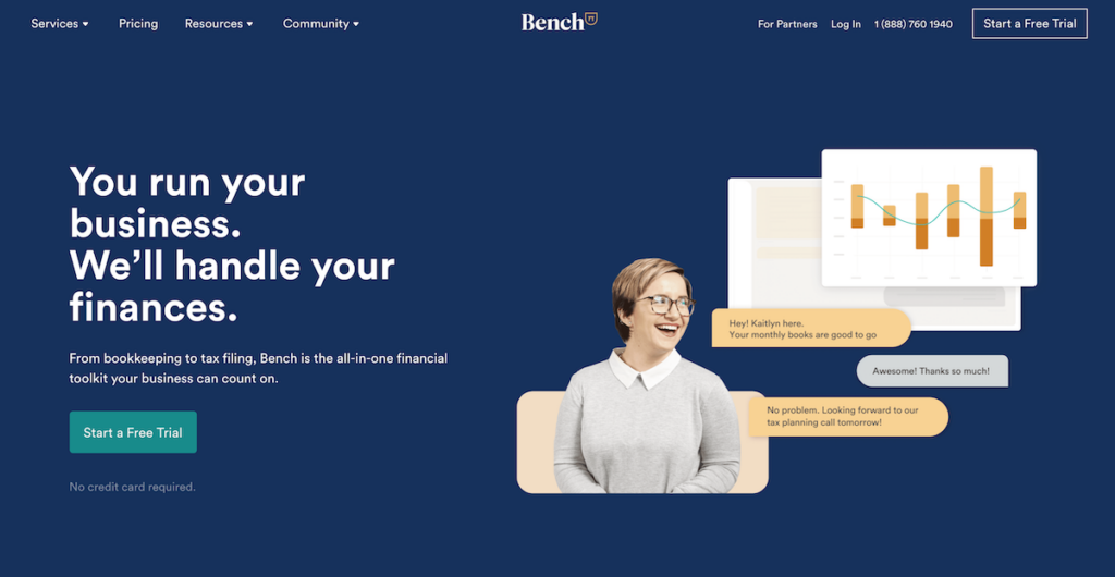
What do accountants, book keeping guys, and fancy financial heads know a thing about marketing?
Oh, they do. Just look at Bench
See the pretty girl talking to you over coffee? That did it for me (except that I am in India and I don’t think Bench can serve me here).
The pretty lady aside, there are just two fields and a free trial.
Bench is your personal book-keeping team. Instead of struggling to find some freelancer or an expensive full-time hire, just pick Bench and they’ll take care of book-keeping, auditing, accounting, and your other financial needs.
MyClean
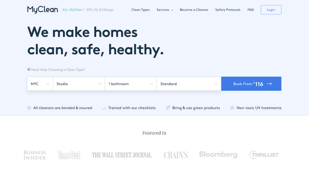
You’d think that “cleaning” can be a boring business to be in, right? Maybe. But MyClean does remarkable things with its home page.
Notice how you can choose your service, location, and go for a booking right away. My only worry for this home page is that MyClean might just miss out on future bookings (by using marketing automation and email nurturing) by focusing on the “now”.
A great looking page, especially for an industry that at least is not as hot as SaaS tools.
Intercom
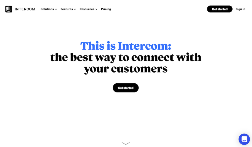
Intercom brings it all together: customer support, livechat, and the fact that you are a lovely human being who happens to run a business and also care for your customers.
It’s very popular already but take a look at their home page and you’ll love it – and not because it’s just so adorable to look at.
It’s also because Intercom makes it so damned easy to “get started”. If you are a nosy guy like me though, you’ll probably watch the video first.
The page packs a punch. Aren’t those characters on the page awesome?
Airtable
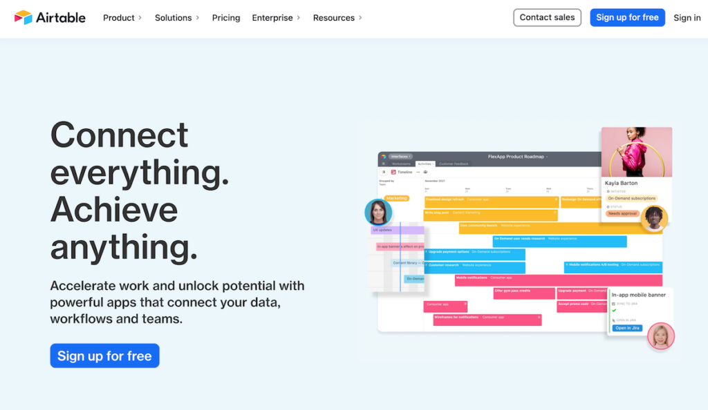
Power of a video, the adorability of a child, and a single-field signup ask. That’s what makes this page such a beautiful and effective home page design for Airtable.
Airtable is an online database service. As a product, is something like a Swiss army knife. Dylan Tweney of VentureBeat writes, Airtable aims to target people who want to organize information with much greater flexibility than Excel, for instance.
Don’t let Airtable’s simplistic explanation of what it does fool you, since there’s more under the hood. The dra-and-drop interface allows you to connect millions of specialized apps, each serving a unique purpose for users.
Using Airtable’s Integrations, you can also connect other apps with Zapier and make your data come to life.
Marvel App
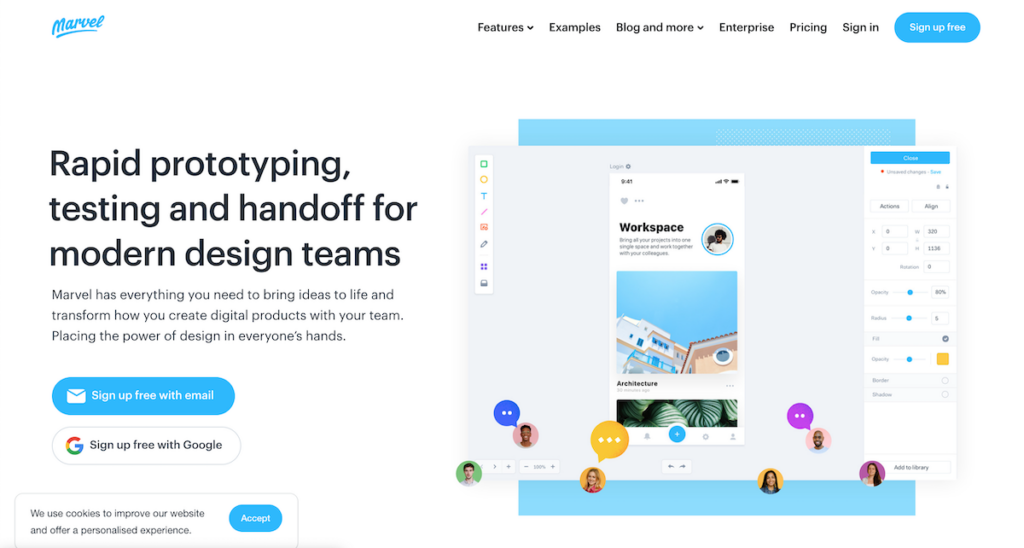
The simplistic design, a demonstration of what’s possible with an image along the CTA, and the CTA itself is a winner for Marvel App.
The Marvel App was built was developers and designers to help them design, prototype, and collaborate with teams and/or clients.
Designers and developers can create app screens directly in Marvel or add assets from Sketch or Photoshop or sync with cloud storage. Marvel’s editor allows you view, edit, and share designs right from your iphone or tablet (apart from the web).
Mixpanel
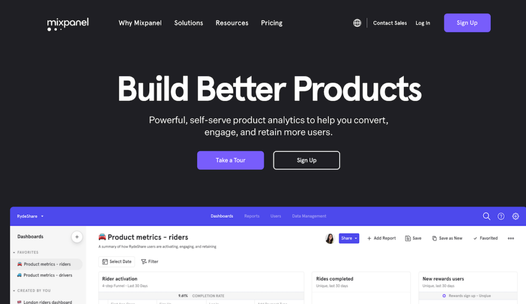
A single call to action that fires off with users just submitting an email address to get started is something that’s apparently worked for MixPanel.
MixPanel is that little startup with an Analytics tool that beats Neil patel’s KissMetrics today. MixPanel allows you to get analytics for you to understand a users’ journey with instant insights. It also has built AB testing, funnels, engagement, and more.
Is their home page working?
The company just raised $65 million from Andreessen Horowitz which now values the company at $865 million – a firm step towards a world of data analytics.
That tells us something, eh?
Asana
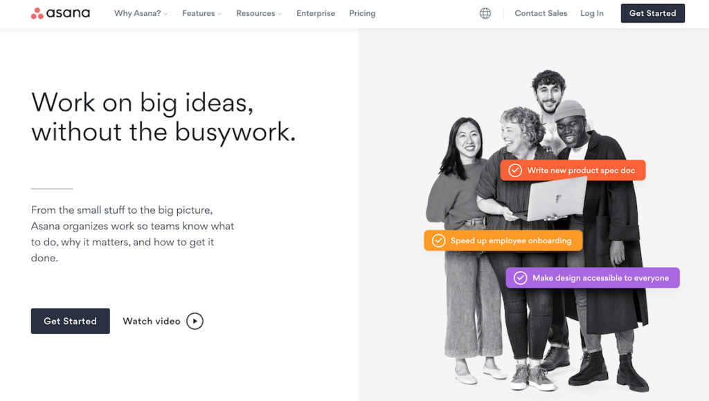
Asana has color, charm, and simplicity built into its home page design. On top of that, it’s easier than ever to create an account. Signup or just login using Google.
How easy is that?
Now, a lot of people know Asana. It’s a fantastic project management tool and this is the one I use to manage all my projects, along with those of clients. Asana makes it really easy to setup projects, tasks.
If you are smart, you can also use Asana for a lot of other purposes such as a CRM, a bug tracking tool, a support desk, or whatever.
It plays well.
Front
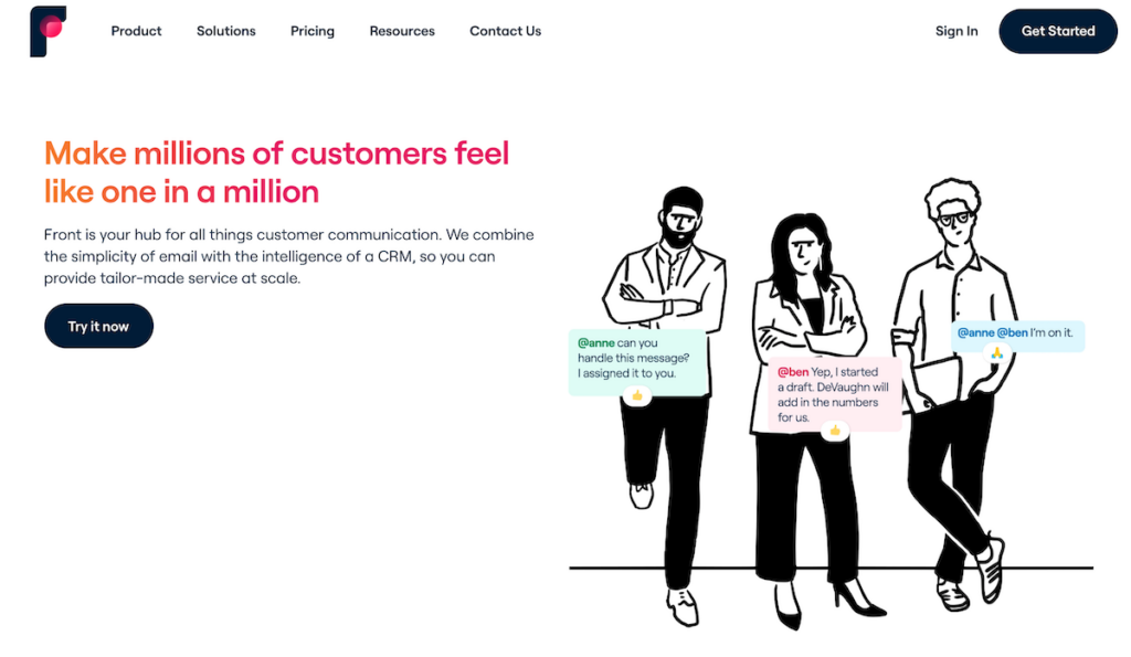
Imagine yourself, in the normal course of a day: blog posts, twitter feeds, Whatsapp messages, phone calls, messages, and Facebook.
Doesn’t your life look cluttered already?
Now, multiply this clutter by 10 times or 150 times. Can you imagine the chaos?
That’s what Front hopes to clear, and is a dream come true for teams. Front brings all yur external messages, emails, support tickets, Twitter updates, Facebook Messenger messages, chat, and SMS into one, unified Inbox.
The home is as simple as the app proclaims itself to be. Simple headline, a description that aids the headline, and a tempting 14 day free trial is all that there is between their users and themselves.
Gusto
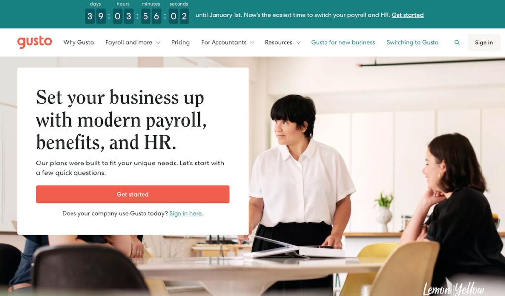
We are selling to people. Humans read your blog posts. Jon doe finally buys from you or becomes a user.
Gusto knows that.
Take a look at their home page (and I happened to know their previous home page variant too) and they’ll usually feature a real human being (happy, of course) working away. Because everyone starts from the left of the page, the minimalistic signup form also sits on the top left.
Plus, they have a one-month free trial. Gusto’s home page ticks off everything on a typical landing page best practice guide. Minimum possible fields on form, a great background image, and testimonials (for social proof).
Sumo
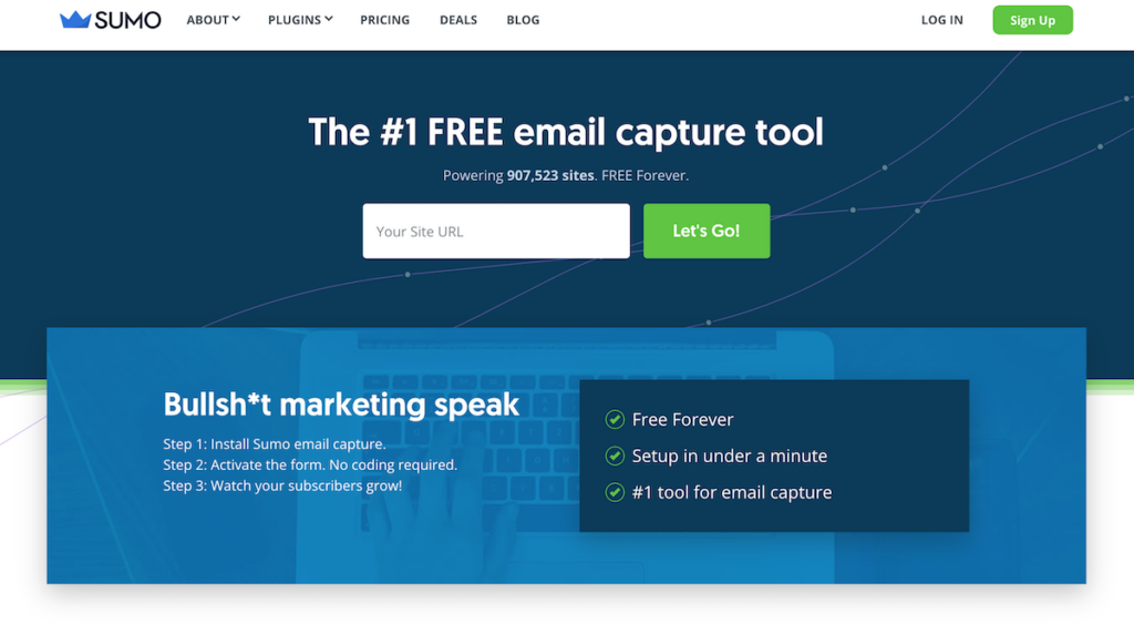
What does a $7-million-dollar company know about landing pages, funnels, and the art of signups?
They do know a lot when they seem like they practically invented it.
Sumo is a power Suite of tools built to do just one thing for you: build your subscribers. It also helps you get traffic and boost your social presence (but those are secondary).
For yeas now, their home page has been a terrific marketing case study: a strong offer (try free) and a simple way for people to signup.
You know about Sumo. I don’t have to say much.
What do you think of about these designs? Are you trying to work and get your own homepage turned into a landing page? Tell me what you think.
1 thought on “17 Front Page Designs Built For High Conversions”