
You know what? If you are doing any Landing Page Design Mistakes, you are seriously embarrassing yourself. On top of that, you are losing out on opportunities while throwing marketing dollars down the drain.
Landing pages are the single most important element in your sales funnel. There’s just no point in sending traffic to a website – whether you do organic marketing or paid advertising.
Web site home pages are generic with tons of different things that call for a visitors’ attention. That’s why it’s no wonder that most visitors only “visit” and “do nothing.“
Things like conversion centered design, landing pages best design practices, and everything else you might read about landing pages is of no use if you don’t even have a landing page in the first place — which is one of the major landing page design mistakes by itself (minus the design).
You need landing pages because they single-handedly pull your conversions through the roof. They have the potential to help visitors focus and take action on an offer you are making on your page.
It’s not rocket science; it’s just common sense.
Oh, you say you knew about the importance of landing pages already? Not so quick, Charlie.
Let’s traverse across continents, alright?
United States
Here’s proof that even a Top SEO agency doesn’t know a thing about conversions (=cash) except what they know (which is a fraction of what digital marketing is).
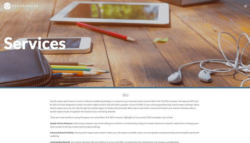
Percepture is NYC’s Top SEO agency and their landing page is nothing more than a regular page on their website. When you land there, you see a run down of an explanation of what SEO is.
I mean, as if Moz and Google itself wasn’t enough for a quick download on what SEO is, where are all the goodies that a landing page must have?
How can a business that has so much to do with landing pages make these landing page design mistakes?
United Kingdom & India
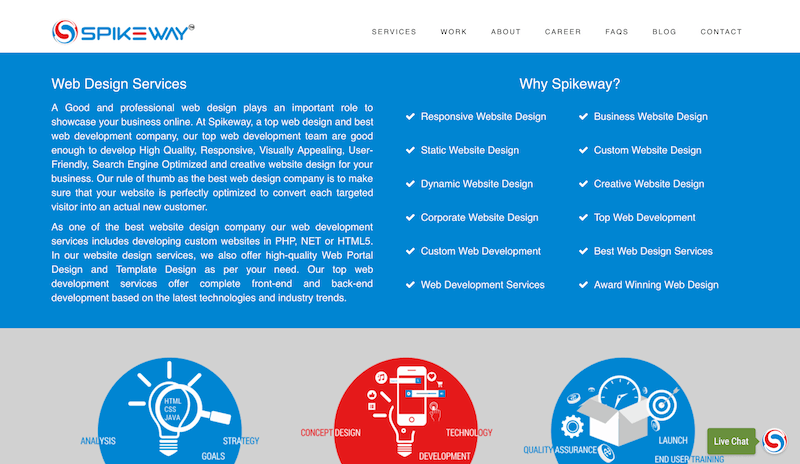
Although this page showed up on results on Google UK, Spikeway is the worst of the lot. A big wall of text on a section of the website where most eyes wander, a big navigation menu, a list of reasons why you should consider SpikeWay.
Let’s make it easier for you: They’ll never be able to design your websites or landing pages that’ll make a single dollar, ever.
Many businesses do not use landing pages at all. If and when they do, they design landing pages like they design websites and that’s not serving any purpose. So, how do you make sure you are getting everything to do with landing pages right?
This is how:
Don’t depend on developers, ever
If you want landing pages developed by a web developer on HTML5 and CSS3, you are in trouble.
Most web developers don’t know a thing about conversion centered design. They follow the same design principles they are familiar with (related to regular website design) and they design landing pages similarly.
Plus, they take eons to design a single landing page. Are your campaigns going to wait on every single landing page, a couple of variants on the original page, and a grand total of 16 landing pages that you need?
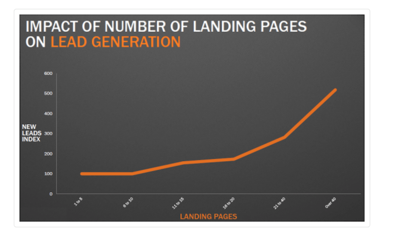
Pamela Vaughan of HubSpot, while referring to a Marketing Benchmark report, writes that the more landing pages you have, the more leads you can generate. When the number of landing pages is increased from 10-15, businesses apparently see a whopping 55% increase in leads generated.
Now, let’s see. Assuming the cheapest developer or designer you find designs a single landing page (and they don’t even supply copy) for $350. What are you spending in total for 10 landing pages? Did you just say $3500? Good luck with your ROI.
With tools like Unbounce, Wishpond, and LeadPages, you’d never need a developer. If you still do, I’d be curious to find out what the reasons are?
Severe Lack of design sense
Entrepreneurs have pride. Large companies have interns working on landing pages. No wonder you get some of the crappiest examples of landing pages from some of the biggest business brands on earth (with a few exceptions).
Sherice Jacob of KissMetrics actually pointed to some awful examples of landing pages that actually belong to some big name firms.
Here are a few:

Hermes? With a landing page like this? Is that even a landing page? It looks like a badly design Pinterest board to me.
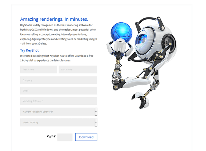
This one belongs to KeyShot 5. Whatever that meant, and if I didn’t know, this landing page isn’t helping either. Captcha? Like I had the patience and What do you do with all those form fields? Ever heard of form love, anyone?
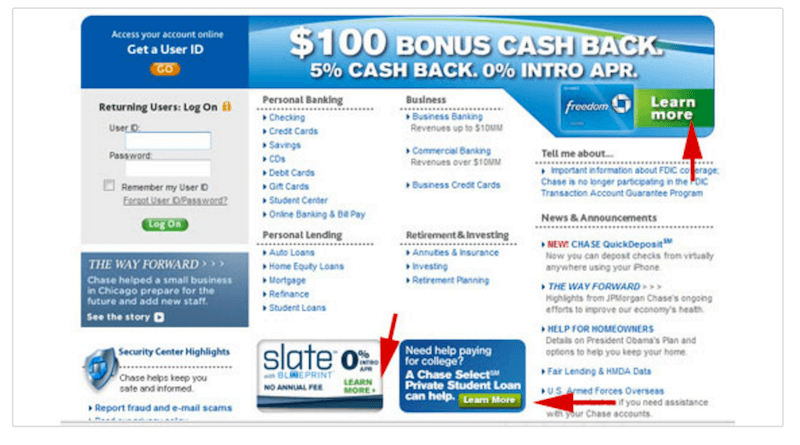
Even shady marketers can do a better job than this one. You just had to believe that it was landing page designed by Chase. Yes, Chase. I’ll repeat: Chase.
Using Design Elements That Are Not Welcome
Let’s try a final rally cry, for the sake of every business out there:
- No navigational menus on the landing page, ever.
- Don’t experiment with fancy user flow options – like I want people to fill up the form and then another popup should show the e-commerce page.
- No clickable links, images, or videos (with the exception of a single video on the hero section, if that video can do it).
- No social buttons on the landing page (put social buttons on the thank you page, “after” a lead signs up.
- No e-commerce, “buy now” buttons, and paywalls on landing pages (no one buys the moment they land on the page).
- No sliders on a landing page.
- No extra elements on a landing page unless those elements have some significant role to play.
- No cheeky headlines and sub-headings. No clever copy. Simple works, even if you don’t like it.
Make this the last time you’d read this. Print it out. Put it up on your office walls. Take the list to bed with you.
No message matching landing pages
Let’s say you are promoting a discount of 30%, storewide. The ad should say 30%. The landing page should say 30%. The headlines, sub-headings, copy, and even the image – it should all be congruent.
Why? Because your users expect a uniform and consistent experience. You don’t want to surprise people while they suffer from a globally applicable short-attention span.
As the folks at Unbounce point it out, here’s an example of a good and a bad message match:
“An example of bad message match
Ad: Get 50% off a Dell Inspiron 9000
Landing page message: Welcome to Dave’s Computer Store
An example of good message match
Ad: Get 50% off a Dell Inspiron 9000
Landing page message: Get 50% off a Dell Inspiron 9000 at Dave’s Computer Store”
Not doing message matching is a sin. Period.
Not A/B Testing Pages
When the feature is built-in (depending on how you build your landing pages), what’s your excuse to not do A/B testing at all?
What’s with that height of laziness? I am sure money doesn’t grow on trees but regular A/B testing does help grow your business.
When you do A/B testing you put whims, fancy thoughts, preconceived notions, and judgments aside. You don’t let any kind of stupidity that we humans are blessed with fudge with our marketing results.
With A/B testing, you let data drive your decisions.
Here are some fantastic results from a few A/B tests, and if that doesn’t help, what will?
Please. Do yourself a favor and get your landing pages right. We have a variety of services that can help you better than all those big names that do a lousy job.
Save those marketing dollars, please?
2 thoughts on “Landing Page Design Mistakes: Are You Embarrassing Yourself?”