Thinkific Performance Checkout helps deliver on a promise that every course creator wants (but might or might not have expressed it as such).
The Thinkific Performance checkout helps you convert better, reduces friction with Checkout, and helps you do more with less.
Most course creators are not even aware of the losses they make just because the usual “course checkout” workflow is 2-3 pages long.
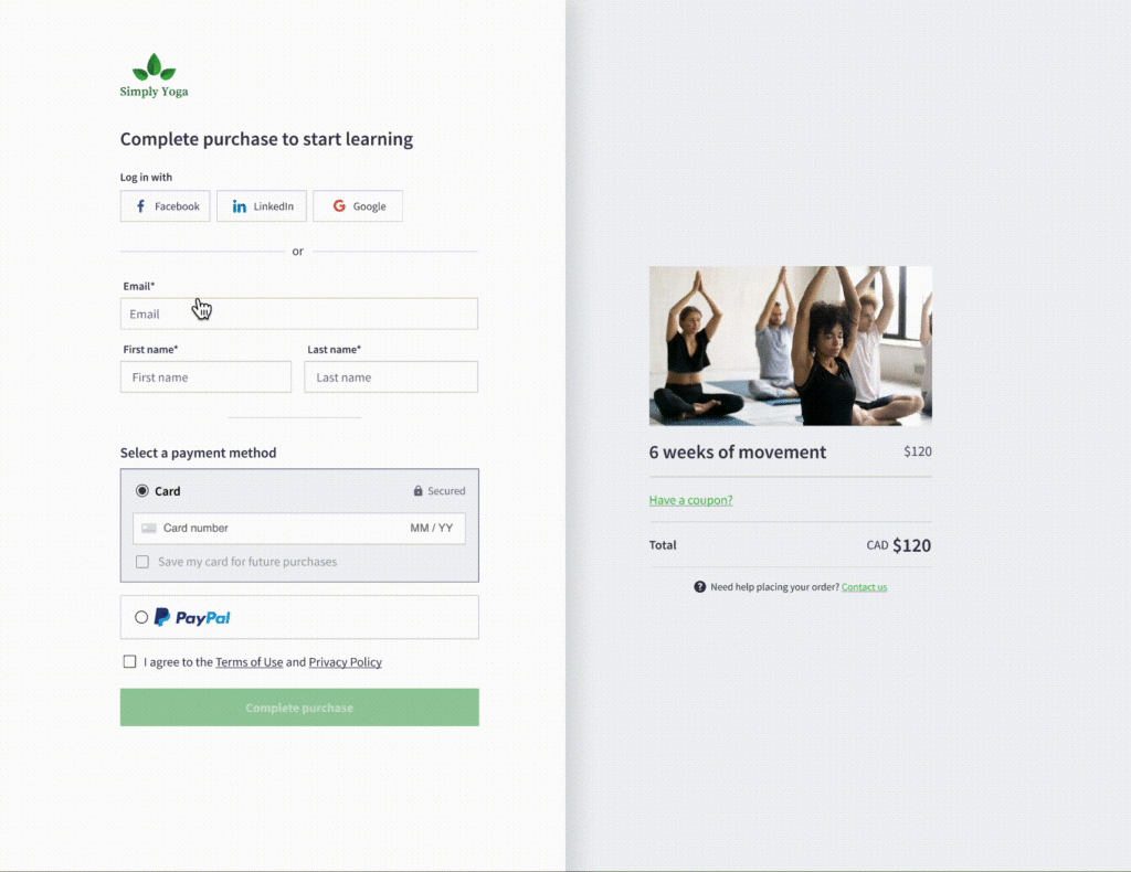
Thinkific just launched a faster checkout experience for your course checkout pages. Instead of the usually two-page checkout flow, you’ll now have the entire checkout process consolidated into a single page.
Just like that.
See how it works:

Optimized Checkout Experience: How It drives more sales & business growth?
According to the Baymard Institute, eCommerce shopping cart abandonment rate is at a whopping 69.82%.
Almost 70% of your potential buyers “abandon their shopping carts” and never buy.
Asking for “account creation”, “”making customers fill out endless forms”, or asking for “more information than you really need” are some of the top reasons why shopping cart abandonment happens.
Apart from the “58.6% of users who were not ready to buy and were just browsing”, all others abandoned because of things that were in your control — other reasons included things like “asked to create an account”, “website was slow”, and “website crashed”.
Really? You could do something about those. Right?
What does Thinkific Performance Checkout Deliver for you [course creators]?
In one word: higher conversion rates.
Thinkific performance checkout now helps you sell your courses easier (with a much higher conversion rates).
Specifically, this is how it helps:
Super fast, one-page checkout
The longer the checkout process is, the lower your conversions are. Add a couple of pages more and you can kiss your business goodbye.
Long, wonky, broken, and tedious checkout processes practically hurt your business (see below).
eCommerce checkout should be simple, straightforward, and friction-free. Period.
Thanks to the new and improved Performance Checkout for Thinkific, potential prospects who want to purchase your courses can now complete their buying process (and hence easily sign up for your courses) much faster, minus the hassles.
Eliminate losses with zero customer drop off
You know what’s particularly painful after you put all the effort in for digital marketing such as blogging on a frequency, social media, email marketing, and maybe even paid ads?
Prospects come and go. For a few of those prospects who do trust you enough to buy your courses, they drop off only because of the unnecessary “friction” they have to face. Like, who’d want to fill out a form with 27 form fields to buy a course (that’s delivered digitally?). You get the point.
The information you’ll now ask of your prospects purchasing courses is going to be minimal (just what you need). No need to to fill up endless form fields (#formlove, anyone?).
Ask for the absolute essentials. Get right down to business.
How, you ask?
Before purchasing your course on Thinkific, your customers are no longer required to create an account before payment is taken (Instead, account creation and other custom fields are now completed after payment is taken. How cool is that?).
So, as the folks at Thinkific put it,
“…you’ll still collect more information that’s important to the student’s learning journey, like city, country, telephone number, student number, date of birth, etc, but it won’t interrupt conversion in the checkout.”
Treat Your customers like royalty
With a polished experience for returning customers, you now have the ability to enable auto-fill for data such as customer card details (for existing customers, with a card on file).
One click, and they’ll be ready to make their purchase (since they already made one before). There’s just no need to have your customers get their wallet out and refill their details (again!).
If your returning customer wants to use a different card, they can also easily edit their card on file and change their payment information.
Performance boost & Best in class security
There should be no eCommerce transactions allowed if there’s no security while those transactions happen.
Thinkific’s Performance Checkout continues with top-notch security that was already present with the existing standard two-page checkout.
Both checkouts use 128-bit TLS encrypted connections, meaning that any confidential information being transferred (including credit card information) is completely safe.
The “Always Improving” Smart Checkout
Thinkific Performance Checkout is a priority for the folks at Thinkific. Most course creators already have a lot to do to sell courses — any technical speed breakers only add to the trouble.
With an entire team dedicated to testing and improving features like “Performance Checkout” and the overall “buying experience” on Thinkific, it’s an ongoing commitment to help course creators who depend on Thinkific for their course sales.
Thinkific, as a result, is focused on continued conversion improvements (as well as new tools) to help course creators sell more.
Take Thinkific out for a spin and see how to sell and manage your courses better.
What do you run your courses on, and why? Connect with me on my LinkedIn community and share your stories. Or on Twitter and share.

