Let’s just say that the Call to action is the hero. It’s the final nudge, the much-needed push, the last mile goodness, and the final torchbearer that completes the work you’ve set out to do.
There’s virtually no effort, campaign, and on-ongoing effort today that ever be complete with that call to action.
If all of the effort you put into design and copy is one thing; what you do with your Call to action is something else.
So what makes some calls to action work while others live unglamorous and mundane life as buttons on an isolated page? How do you make your call to action elements (buttons, links, images, or text) work that much harder?
Here are a few ways to make it happen:
Your CTA button placement matters
Where should you place your CTA button on a page? Above the fold in the hero section? Below the fold, hidden away beneath of a mountain of copy? To the left side of the page? The right ride? Or smack in the middle, above the fold?
Tough question, really.
Tyson Quick of Instapage helpfully points out that placing your CTA buttons — above or below the fold — really depends on your product, how you position it, and what you’d need to do to get visitors “click”.
Your options?
Left or right side, above the fold.
In the Middle, above the fold.
Or, Below the fold, with directional cues.
Here’s a complete case study on CTA button Placement, thanks to good old Oli Garnder of Unbounce.
Always try two landing page variants to test which placement works better for your campaigns. If you use Unbounce, get landing page templates and you also get two variants built-in with every landing page you buy
Is that too much to ask?
Greed. It’s universal, isn’t it?
You might have your reasons for being aggressive or “asking for too much” but your customer won’t care.
Also, your customers won’t give. At least, not so soon.
Your CTA buttons are doing the heavy-lifting for simple things you could ask for, like, an email address, a name and an email address, or entering the zip code, or when you engage them with a quiz.
Asking for $14,567 on your form even with the world’s best CTA button won’t get you anywhere.
This is also one of the most common mistakes people do with their funnels.
Just. Stop. It.
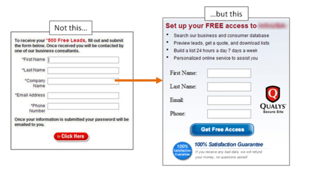
No Implied Value? Don’t Bother with “The Ask”
A Call to Action button is “The Ask”. When you ask for something from someone, you better be clear enough about what they get. The value they get from sharing their data with you should be of “value” to them.
Here’s an example Daniel Burstein of MarketingExperiments shares

The first example promises a “call”. Who the heck wants that?
The second example promises a database of customers and a possibility of building a list of potential customers, anytime. You also get a personalized service. Certainly, I’d choose the second one.
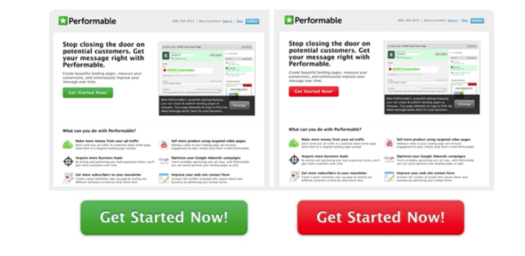
Use colors to Make them unfailingly visible
You are likely to have dedicated primary colours and secondary colours that constitute your brand, and you are in like if one of those colours is a striking contrast to the other.
If you use your primary colour as the main background colour, for instant, use the contrasting (and brighter) colour for your CTA buttons.
While you’d ideally want to do A/B test your CTA button colors, brighter and sharply contrasting colors usually pop out and beg for attention. They are visible and they capture your visitors’ attention.
Guido Jansen of Usabilla swears by green as the “go to” color.
Meanwhile, Joshua Porter of Hubspot claims that red works better.
Confusing? Maybe.
That’s why it’s best if we stick to the basics. As Mary Fernandez of OptinMonster writes
It’s pretty much impossible to prove that any one color is better than any other color for persuading an audience. There are just too many variables, and too much conflicting evidence to come to any universal conclusion.
So instead of trying to find the “perfect” color, go for the color that increases the visibility of your call-to-action. With this simple and proven approach, you can virtually guarantee an increase in conversions.
Stay on the brand. Use colors that pop. Then, do A/B testing
Also, read this post by Otti Niggulis on ConversionXL on Which Color Converts The Best?
CTA button copy = Context + personality
Make a solemn promise today: don’t use “submit” or one those sissy pieces of text as your CTA button copy.
It helps if you use the flow of the headline and subheadings that usually precede your CTA button to add some zing to your CTA button copy. Then, add a strong verb somewhere in there and add a layer of personality.
Thanks to Liz Lorge of LeadPages, this is really how it should be done:
Here are a few examples:
Headline:
Run Your Business Smarter. Leave Social management to us
Subheading
You have a business to run. Did you really think you’d want to spend all day on Facebook and Twitter? Leave that to us and we’ll manage your social accounts for you.
CTA button copy: Manage My Social Accounts
Headline
Sell your home Without Lifting a Finger
Subheading
Selling your home can be a pain, not to mention paperwork and legalese. We do everything for you to help sell your home. You can live your life meanwhile.
CTA button copy:
Sell my home
It’s not going to be easy but it’s not hard either. You just want to be sure to make your CTA buttons flow with the rest of the copy. Think of CTA buttons as elaborate, action-oriented finish line for your copy.
Keep it Singular, Stupid
Some landing pages and website pages have an insane number of calls to action.
Stop. Step back and think: Which darned button do I click on if I have 17 Calls to Action on a single page?
Go back to the basics of powerful advertising. The AIDA (Attention — Interest — Desire — Action) principle has a single action in it.
It’s easier to choose for me when I have a single button to click on. Not two. Not three. Certainly, not 17.
Whatever you do, don’t build a page that competes with this one:

Your CTA button is too important for you to take it easy. Make your Calls to action elements work for your business.
Learn more:
The Ultimate Guide to Call to Action Buttons