Calls to action -- those are million-dollar buttons. Good calls to action put money into your bank account. In some cases, they are the reason why a landing page converts so much better than others.
Or what some businesses are able to grow while others can’t.
It’s all about calls to action everywhere -- be it your home pages, landing pages, Facebook ads, Google Ads, or your funnels
Without knowing, you are already being hit by a swarm of CTA buttons and maybe you just didn’t think much about it. So, for a refresher, here’s one right here.
If you are looking for an easy way to add CTA buttons, here's a video to help:
There are certain fundamental rules to Calls to Action. It’s not as easy as it seems.
According to Rikke Thomsen who wrote How to Write Powerful, High-Converting Calls to Action, here’s the condensed version of CTA rules:
- Define your goal and purpose before writing.
- Your CTA should always be short and precise.
- It should support your overall purpose and message.
- Focus on the value in your offer – “What’s in it for me?”
- It needs to tell people what to expect when they click through.
- Don’t ever write “Subscribe” or “Sign up. Be creative!
Also read: How to Make Calls to Action Buttons That Get Results
Some marketers and businesses have mastered the art of creating inviting, click worthy, and truly beautiful CTA buttons. Here’s a list of some of them:
Sleeknote

Sleeknote is a fantastic tool you can use to boost your lead generation efforts with sleek, beautiful, and effective lead generation pop-ups, slide-ins, in-line forms, trigger-based pop-ups and so much more.
The folks at Sleeknote call them “in-site messages”, so be it.
You just have to love their homepage with a lovely layout, product images in the background, social proof, and the call to action that just stands out.
As if the CTA prominence wasn’t enough, there are two buttons which are both inviting -- one for a “free” demo and one for a “free trial”.
ViralLoops
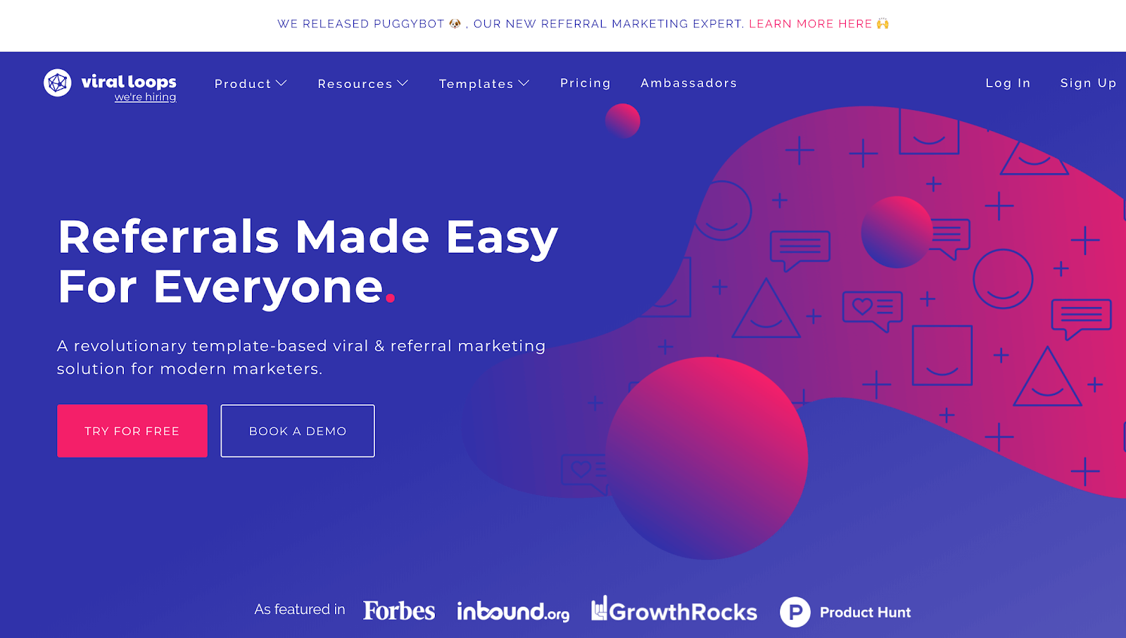
Viral loops make doing referrals easy. It’s one of the best referral marketing tools you could use for your business today.
The home page brings in contrasting design, amazing graphics, and calls to action that are subtle and effective. The CTA buttons stand out against the blue background and social proof comes reeling in right below those buttons (even before you start scrolling).
With a simple headline that gets the job done to a subheading that adds value to the headline itself, Viral loops has a lot going for its carefully crafted Call to action buttons.
Drip
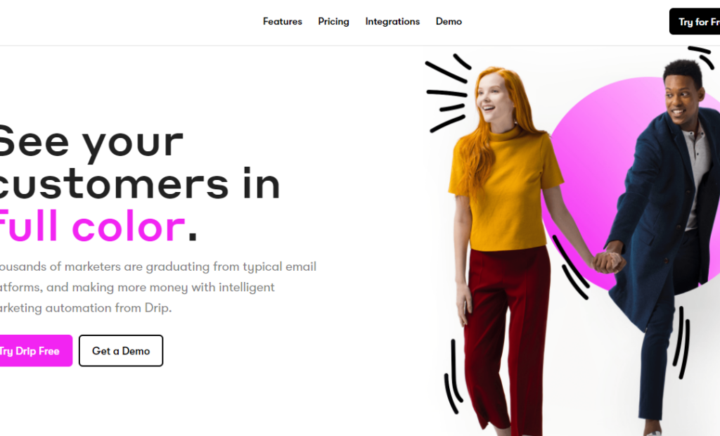
As Dustin Robertson -- Dustin Robertson, the Chief Marketing Officer at Drip -- likes to put it,
“Drip is the CRM that Salesforce didn’t build. “
Drip is undergoing a complete rebranding and changing its focus to be the best ECRM (ecommerce Specific CRM) in business. It’s well on its way.
Drip’s homepage is now all colors, and communicates just one thing straight: Know what your customers are up, graduate from typical email platforms, and make more money with Intelligent Marketing automation.
While the colors, the branding, and the image of two “real” people goes a long way to make it all real, the call to action takes all the risk away with a “Try Drip Free” button or “Get a Demo”.
Go ahead. Try Drip for Free
TodoIst

Disorganized that we are, we’ll welcome anything that promises a way for us to organize our lives better, be more productive, and manage the only thing we all have less of: time.
Todoist has long been awesome with their landing pages, home pages, and marketing in general (a huge and loyal following is an added plus).
Their landing page (also homepage) features a single illustration and a headline that can relate to all of us.
Organize life? -- Yes, please.
Then, go enjoy it? -- Why not?
Then, the subheading text delivers exactly what you wanted to hear. Of course, it’s free to get started and the big button is too hard to miss, eh?
BuyMeaCoffee
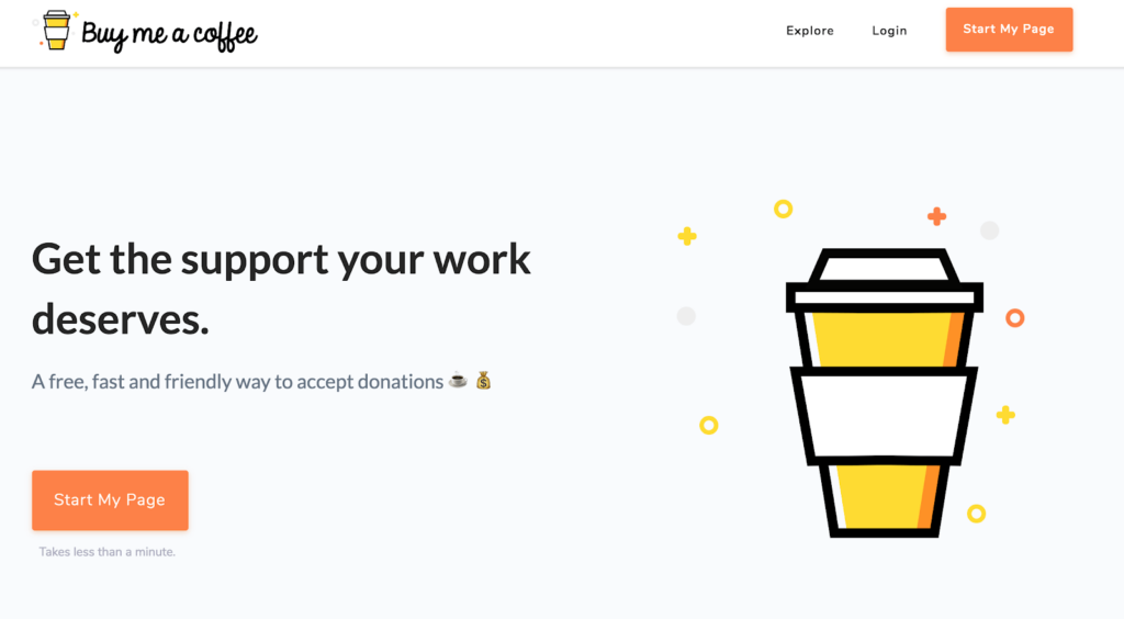
Do you want to accept donations for charity work? Or maybe you created something that you decided to give away for free in exchange for voluntary donations?
That’s awesome.
BuyMeaCoffee was built for you. One look at their landing page and you can’t help but think otherwise.
“Get The Support Your Work Deserves” -- It’s high time this is due.
“A free, fast, and friendly way to accept donations” -- my 6 year old niece can understand this.
Again, there’s a button that stands out, staring at you (the creator or producer) urging you to “start my page”.
Now, doing something like is long due, isn’t it?
Pastel
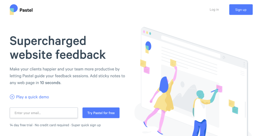
Pastel makes it easy for you to add sticky notes to your website designs or landing page designs (while you are at it) and get instant feedback from your team members or your clients.
Pretty straight-forward, right?
Their landing page is simple, colorful, attractive, and effective. The illustration itself tells you what Pastel is all about. But in case you mistook that to be a whiteboard for educational institutions, the headline tells you all.
The subheading makes it easy for you to know what it does for you (and the 10 seconds is appealing).
Notice the “Play a quick demo” link? It’s right there even before they ask for the ubiquitous email.
Talking about the call to action, an email address (one-field) is all that you’d need to give away to start using pastel and save hours of to-and-fro communication game with team members or clients.
Asana

Asana is a powerful, popular, and truly a robust project management tool for yourself or for teams (we use Asana for our agency work to manage clients and projects).
Using an incredibly simplistic and clear landing page (as a home page) there’s no need to over-convince you to help you to manage your projects and tasks.
While it’s rare to find a three-word headline, Asana doesn’t need more than “Move work forward” to get the point across to you. The subheading makes it much more clearer.
It’s a freemium product so dropping your email in and “Getting started” is as easy as reading this is.
MailChimp
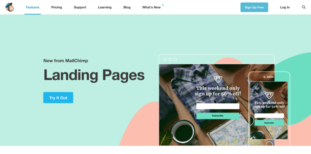
I’ve always loved Mailchimp’s product positioning, pricing, feature set, and branding. So much that I even wrote on why we should all learn a thing or two about branding and marketing from MailChimp.
Here’s the current home page (as on March 2018). Did you ever see anything more minimalistic than this?
Their newly launched “Landing Pages” feature is now right on the home page egging you to try it out.
So, that’s exactly what the page says. Go “Try it Out”
Since you are here, also read up on which email marketing tool you should use: Mailchimp Vs Drip
Manychat
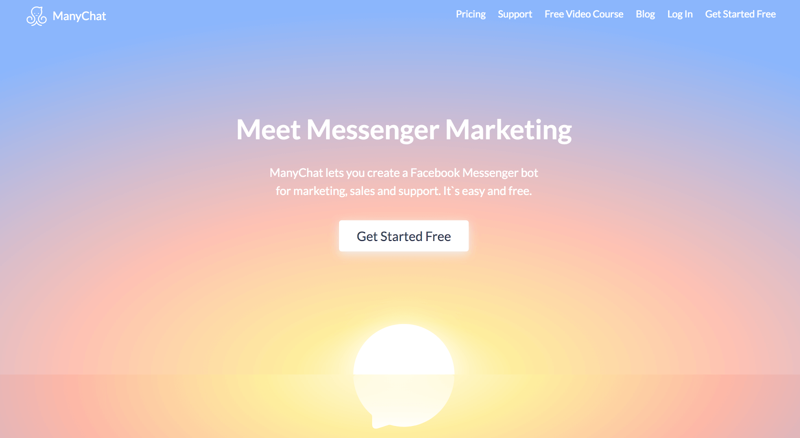
Staying on with the trend for minimalistic and still effective Call to action (CTA) examples, say hello to Manychat -- a tool to help you build Facebook Chatbots.
Land on the page and you’ll know exactly what it is, what it does, and there’s nothing on the background to distract you.
Another one of those three-word headlines that still communicates. While I personally think that the CTA button for this example could have been in another color, no one can argue with the sheer seductive power of “free”.
Convertfox
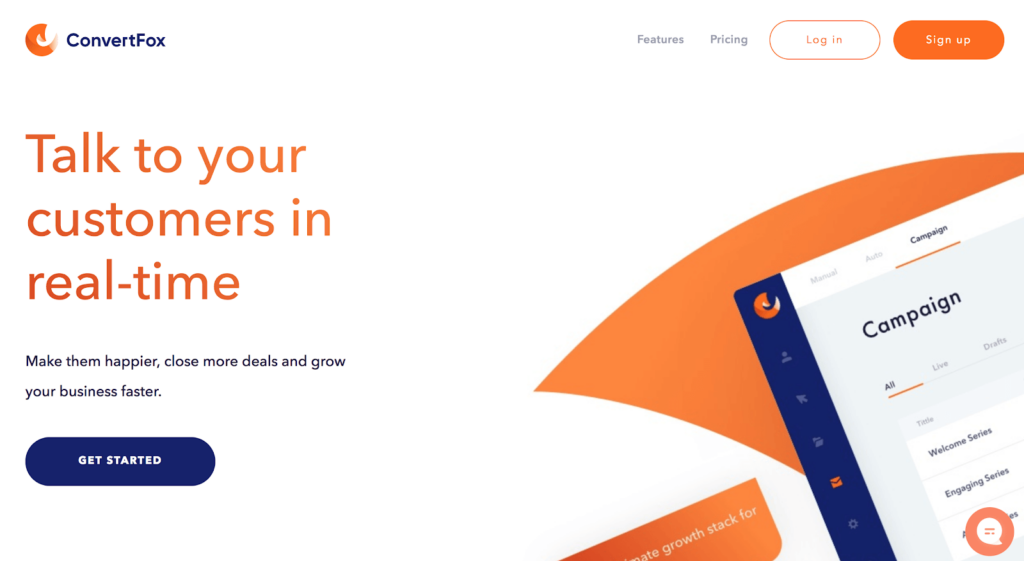
Convertfox combines the best of livechat, email marketing, and team collaboration to help you engage with your website visitors, customers, and then keep those relationships alive (with a mix of chat and email).
Simple, Minimalistic, and On Brand, the Convertfox homepage could give professional landing pages a run for their money. Clear and simple language lets you know what Convertfox does, in less than a second. The use of white space, product image to the right, and
The simple “Get Started” CTA button sits there, waiting for you to close more deals.
What are some of the best CTA examples you’ve come across? Share them with me here.