Data visualisation for marketing is a gift that you probably didn’t use yet.
It’s one of those things that has the power to transform boring data into visually-rich, stunningly insightful, and an absolute treasure trove of information about your “results”.
Visuals matter (even if it's just you, trying to figure out how well your marketing is performing). According to MIT, 90% of the information processed by our brains are "visual". The human brain can process visuals (like images) in less than 13 milliseconds.
The results you work so hard to get. The countless hours you spend creating content. The selfless love you showered on social media channels like LinkedIn, Twitter, YouTube, and others.
You deserve to be rewarded for all the work you put in, then not take it when it’s presented to you, right?
What is data visualisation for Marketing?
Don’t worry, I won’t go all “technical on you”. There’s a bit of tech but that works behind the scenes anyway.
Data visualisation for marketing only means that you have a neat, organized, and an accurate way to measure, report, present, and view data in formats that make it really easy for understanding how your website and/landing pages are performing.
3 Popular Data visualisation tools for Marketing
There are several data visualisation tools for marketing, and many of them approach this in their own way. Some are free, and some are paid.
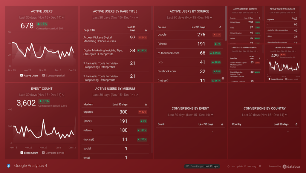
Everything with data visualisation for marketing happens with “dashboards”. Period.
Either way, here are a few data visualisation tools for marketing that you should know about:
Google Data Studio
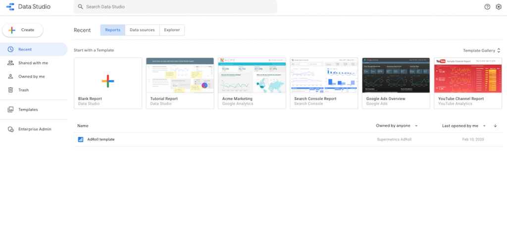
Google Data Studio is like the capable cousin Google Analytics had (which by itself can present a lot of data about your website, as far as basic data visualisation is concerned).
Google Data Studio pulls in data from all its cousins — Google analytics, Google Ads, Google Optimize, and more to present neat dashboards that you can for reporting (or use them for client reporting if you are a marketer working with clients).
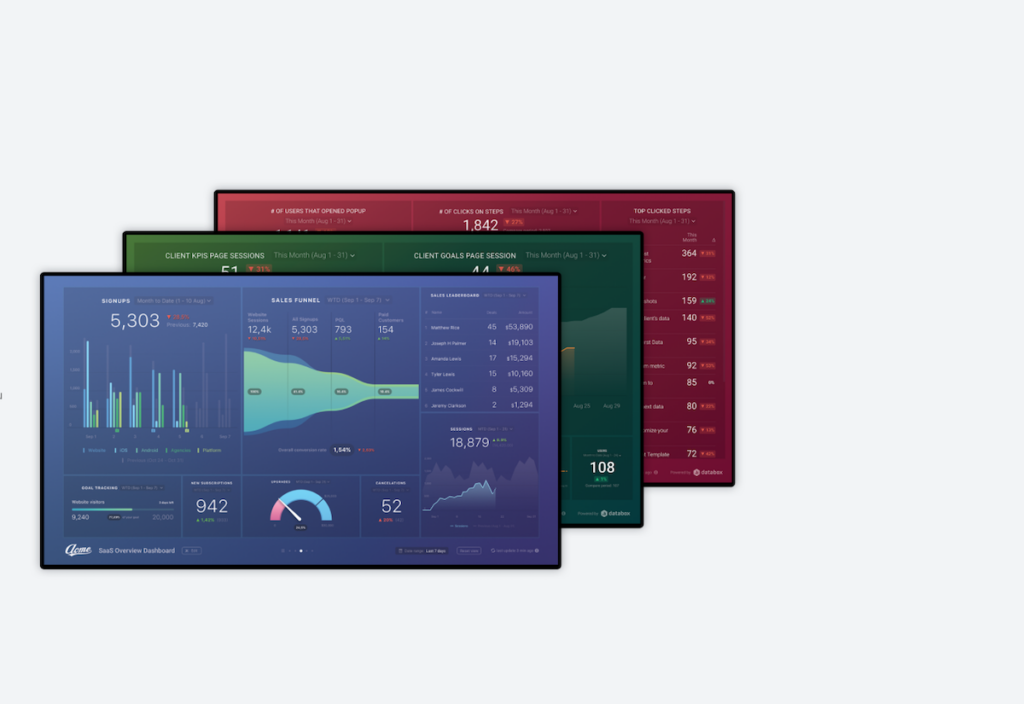
Databox
DataBox also uses Dashboards but goes far beyond Google Data Studio as far as data sources are concerned.
All that while, it also makes it ridiculously easy to “connect” sources (and integrations) and then create dashboards of all kinds (including email marketing tools, CRM systems, other marketing tools you use, and more).
Databox also brings in all the information on your social media platforms (such as Twitter followers, follows on LinkedIn brand page, YouTube Channel Growth, and more).
Learn more about what DataBox is and how it works
Supermetrics
Think of SuperMetrics as analytics on “”steroids”. SuperMetrics connects even more sources of data (both natively and even more with what they call “connectors).
You also get SuperMetrics for Google Data Studio, excel sheets, Snowflake, BigQuery, and more.
Think of practically every source of traffic or other data you might need. For instance, SuperMetrics connects with Quora Ads for enhanced reporting.
Kinsta has several other Data Visualization tools that I didn't mention.
Which data visualization tools (free or affordable) do you use? Connect on Twitter or LinkedIn and let me know