Wondering how to use Databox? Let's get to "Why" first...
What’s the traffic to my website looking like? Go to Google Analytics and login.
What is my website and/or blog performing on search engines like Google? Go to Google Search Console and login.
How is my linkedIn company page doing? Login.
How is my Twitter account growing in terms of followers and more? Login to Twitter and head to Twitter Analytics.
Pretty lame and boring if you ask me. That’s not counting just how much of a waste of time that is.
Solve that problem in a way you never thought possible. Use DataBox
What is Databox?
How Does Databox work?
- Sources
- Databoards
- Databox Designer
- Databox visualization templates
- Looped Dashboards
- Scheduled Snapshots
What is Databox?
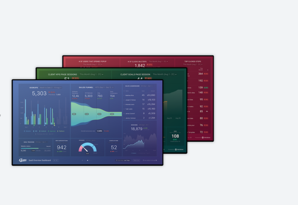
Databox is an incredibly useful tool to help bring all your analytics & metrics home, to a single destination using dashboards -- a visual delight to enjoy while being extremely useful to monitor data, visualize growth (thanks to your marketing efforts), to stay on top of metrics (or data) that’s most relevant to your business.
It’s easily one of the best analytics and data visualization tools available today and you can start for free.
How does Databox work?
Databox uses “sources” (like Google Analytics, LinkedIn Ads, Quora Ads, your social media accounts, and more) to pull in data from all (or the specific data sources you choose) into “Databoards” -- or dashboards which you can view at any time, share, export, compile them into comprehensive reports, and more.
Here’s how to use Databox:
Sources In DataBox
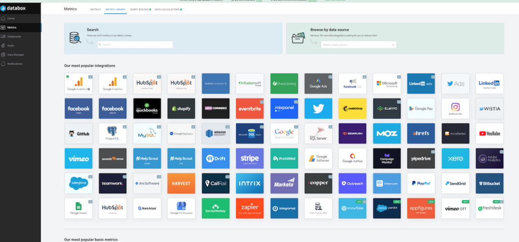
Sources in Databox are exactly what it sounds like -- where are you getting the data from? Some of the most common (and popular) sources are Google Analytics (includes Google Analytics 4), LinkedIn Ads, Social media accounts, Google Ads, Facebook Ads, eCommerce (like Shopify and WooCommerce), and more.
Inside Databox, this is the first step you’ll take. Select a data source, follow the prompts (or instructions) and connect Databox with the source.
Databox then pulls in the information from the sources to allow you to visualiize, which leads us to…
Databox Databoards
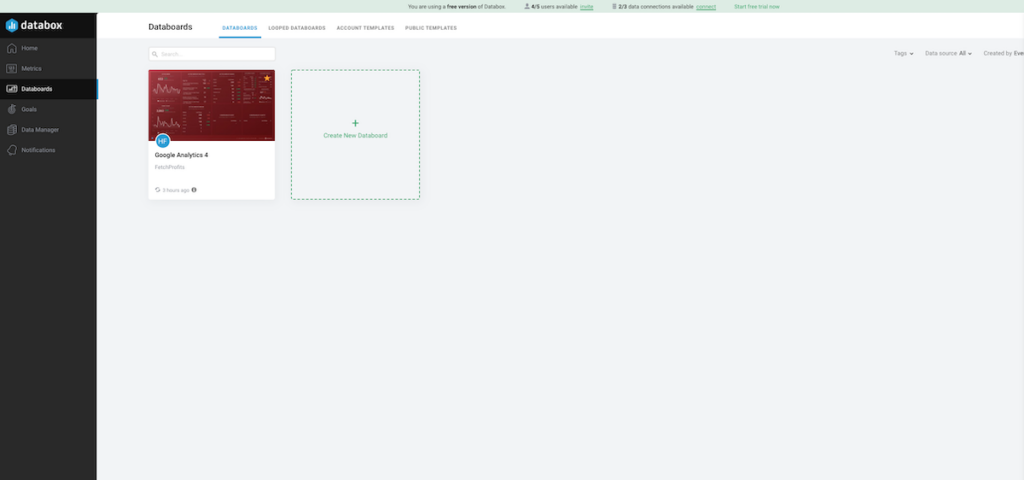
Databox calls dashboards “Databoards”. This is where you visualize your data streaming in allowing you to see the data (from your data sources) together with the visualization type you can set up. Inside DataBox,
Datablock visualizations available, including Line Graphs, Pie Charts, Funnels, Progress Bars, and more.
Databox Templates
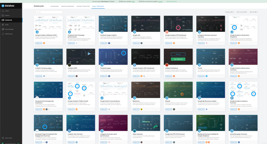
If you want a quickstart with your data sources and databoards (or dashboards), Databox templates come to the rescue.
These are pre-built dashboard templates that you can use either created by the Databox team or other agencies who use Databox for their clients, client reporting, or for their own internal purposes (thank you, people).
You can preview templates to see how they look like (with sample data).
Or “use templates” as they were by swapping the sources and design settings inside Databox.
Databox Designer
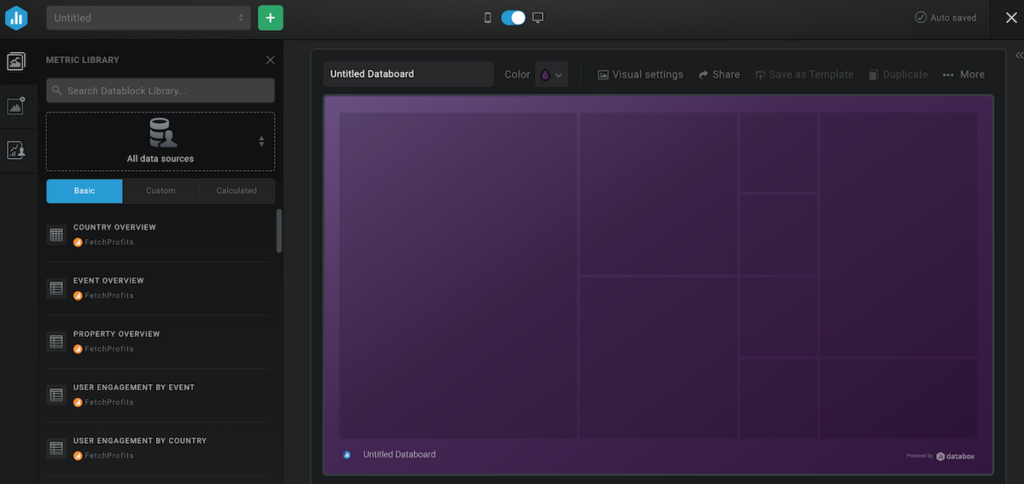
Want to start from scratch? Do you have unique requirements for matching data sources and data visualizations? You can use the designer inside Databox and build your own data visualization dashboards.
As a part of customizing dashboards, you can add, delete, edit or resize Datablocks. You can highlight the right Metrics in your reports.
You can also update colors and logos to personalize the Databoard.
Note: all Databoards in Databox are optimized for desktop and mobile use.
Looped Dashboards
One single dashboard (let’s say the one you use to check your Google Analytics reports) can barely do justice to the sheer breadth of marketing efforts you take for your brand or business.
Like me, for instance, you could have blog posts like these. Meanwhile, you are heavily invested in spending time on LinkedIn personal accounts and LinkedIn company pages as well. You are also on Twitter, creating public videos for YouTube, creating videos on Vimeo, and more. Then, you have email marketing as well.
How do you bring all this together?
You use Looped Dashboards, as Databox calls them.
Looped Databoards is a set of multiple Databoards looped together. This creates one centralized Shareable Link to host your full report.
This Shareable Link will display the Databoards with the same Date Range options, visualizations, and data sync frequency as the Databox Account.
The data sync frequency depends on the type of plan you are on (free Databox accounts have the lowest frequency, understandably).
Scheduled Snapshots
Would you like to know how your website has been performing at any given time? Like, say, by the end of the month without you having to manually pull reports from anywhere (including Databox)?
You can do that with scheduled snapshots.
With Scheduled Snapshots, you can share PDFs or JPGs of your Databox reports at regular times. Scheduling Snapshots is a great way to make the data a more regular part of your team's routine.
They are also valuable in that they allow you to easily export Databox reports.
Get Databox and turn your analytics, reporting (including agency reporting) into not only a visual delight but time-saving, accurate, and on the point as well.