Are you guilty of ignoring thank you page design? I am certainly guilty of it.
Let’s say Molly visits your website (looking for a problem for her solution). She isn’t entirely convinced how the solution is going to look alike, so she’s browsing. She found you, thanks to a simple search on the web (Google?Bing?)
You read this blog and you know that content strategy is critical — as these content marketing stats would convince you of — you do everything you can to present solutions (in your niche) the right way. Complete with blog posts, content upgrades, PDF check lists, videos, and more.
Let’s say you have a tightly packaged, 26-page PDF document answering a burning question you know most of your visitors have (Like Molly does). You give it away for free, led by a hardworking call-to-action button within your blog posts and on your website as a popup.
The question: What happens after Molly signs up? Technically, what goes on out there?
Nada. Zilch. Nothing.
In some cases, the browser automatically starts the download process and visitors get what they wanted (while the page is still being displayed). In some cases (thankfully), there’s a confirmation page or a thank you page that shows up. This page does a little “thank you” dance.
It’s all over. In seconds. Molly leaves. She might or might not read the PDF document she downloaded.
You never know if there’s going to be another data.
Not a good place to be in, right? It can be better with strategic thank you page design.
According to the Leadpages team,
“These confirmation page examples are certainly better than websites that don’t clearly confirm that a user action was successful. But they tell the reader that this conversation is finished. When in fact, it should be just beginning.”
What’s a better way to use thank you pages? How do you approach thank you page design with your business goals in mind? How do you use thank you pages to boost your bottom line?
Let’s dig in:
What’s Thank you Page design? Why Bother? Where do they fit in?
Thank you pages — also called as gateway pages, squeeze pages, or confirmation pages — play a crucial part in a sales funnel. They are the intermediary pages that show up and they do what they do very well (even without an elaborate thank you page design)
Primarily, thank you pages act as confirmation pages (for the action your visitors just took — like downloading a file, making a purchase, signing up for something you offer, grabbing a discount code).
Thank you pages work best for content downloads, PDF downloads, access to pre-recorded live streams, online courses, digital downloads, and more.
Using thank you pages for confirming access to lead magnets is the most common use case there is.
But thank you page design is now an evolved, strategic, and smart move for businesses that know what they are doing.
Read:
The Art of the Thank You Page: How to Make Any Confirmation Page Boost Your Business
How to Create an Effective Lead magnet
Here are some amazing examples, use cases, and ways to use thank you pages:
How to Use Strategic Thank You Page Design [+ Examples]
The key is this: Don’t use thank you pages only for what they were meant to do. Your goal is to push for:
- Increased dwell time on your pages.
- Decreased bounce rate.
- Explore more of your content (and hence increase page views, event counts, clicks, more actions a potential customer can take)
- Making a sale (possibly!)
- Upselling or Cross selling
- Help you track events properly with “URL methods” using Google Analytics, Anytrack, Supermetrics, or any other analytics tool you might use.
Content Marketing Institute: The Content Push
Content marketing institute is a popular educational resource for digital marketing and content strategy. If you happen to download a PDF document titled How to Apply Analytics Data To Make Better Content Decisions, What does CMI (Content Marketing Institute do next?
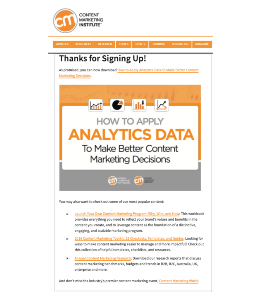
Notice what CMI does:
- Confirms that you downloaded the PDF, complete with the titles (and images)
- Nudges you to take a look at some of CMI’s most popular content.
- This simple thank you page design still sticks to the branding elements: colors, link styles, and more.
- The thank you page helps CMI keep track of KPI (key Performance Indicators) — this is how they measure progress, growth, and other parameters.
Leadpages: Webinar or Training Sign up Confirmation
Leadpages is a hugely popular landing page builder — along with some more tools in their arsenal such as Leadpages Popups and alsothe new Leadpages Website Builder.
Here’s an example of a thank you page design that does so much, so well:
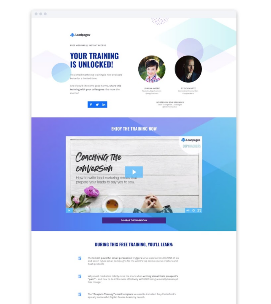
The Leadpages thank you page design does the following well:
- Instantly confirms your signup and also gives a preview of the free training you were promised.
- Puts up photos of who’s involved in the webinar (people’s faces. Never fails)
- The video makes the thank you page sticky. You stay longer there, and you get a button to go and complete your training
- Leadpages also takes the trouble to list down what you get from the free trainer or webinar you signed up for.
Hubspot: Use Thank You Page For Getting Referrals
HubSpot is the big daddy when it comes to content marketing strategy. In fact, many of us did learn the basics of inbound marketing from the brand. It’s no wonder that there are more than 22+ Brands that Win Big with Content Marketing.
It’s unlikely that HubSpot doesn’t use a few of the thank you page design tips and tricks that we are talking about here.
See what HubSpot does after you sign up for a email course (dripped to you, each week):
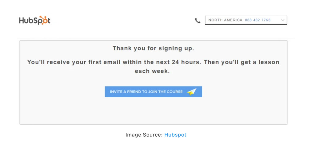
- While the design of the thank you page is typical “HubSpot” [They won’t change, don’t ask], it still does a great job of confirming your signup for the free email course. Thanks you. Provides you with information on what to expect (and when).
- Here’s the big thing HubSpot does with these thank you pages: They ask for referrals. “Invite a friend to Join the course” allows them to take advantage of several more signups for the email course (than they’d do without).
Interested in using referrals as a lead generation strategy? Take a look at some of the best referral marketing software and tools out there.
SnackNation: Signup, On The Double
SnackNation does a lot of things right with its sign up confirmation page or thank you page.
After you download their 59 Employee Engagement Ideas [+ 5 Bonus Ideas], it’s not ending that first high-intent engagement with a regular thank you page.
[Huge thanks to the Demio team, for this find]
See what it does:
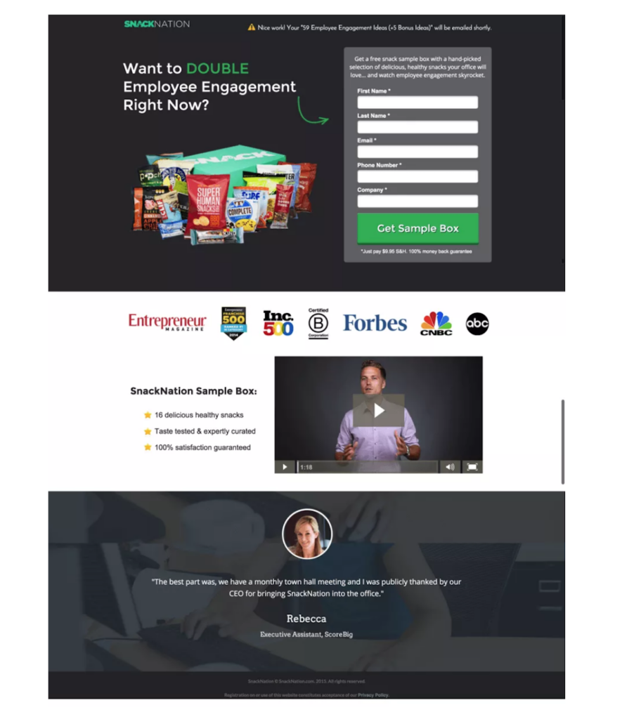
- After confirming your download for “59 Employee Engagement Ideas” PDF download, SnackNation displays a fully-functional landing page (instead of a regular thank you page).
- The thank you page wants more from you, and wants the second date as well. SnackNation directly nudges you to receive a SnackNation Sample Box (with healthy and delicious snacks for office).
- Just asking you won’t do, right? So there’s a video of a SnackNation Sample box
- The testimonial thing always works. Real person. Real photo. Done.
Thinkific: Online Course Sign up Pages
Thinkific is a popular online course creation and management platform. Here’s an example of a simple thank you page displayed for students or customers who just signed up for your online courses.
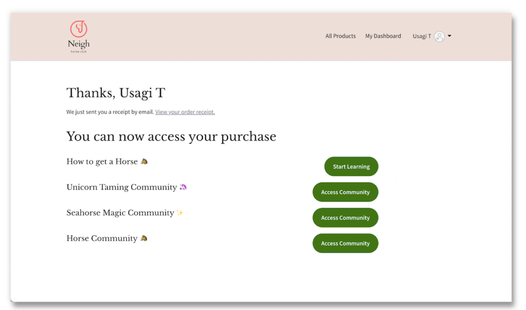
- The thank you page (available by default within Thinkific’s built-in course management pages) can be customized and designed (with your branding elements like logo and colors).
- This is a great idea where you can display courses or products that the student (or customer) has access to, with the buttons pushing you to take action.
With Thinkific, while we are on the topic, you can design complete digital storefronts and custom landing pages for each course, product, or community.
