Let me the clarify at the outset: Best landing page design for me is something that brings in results.
Anything more is welcome, but nothing less.
Looks don't matter. I don't care about anything else except for the singular reason the landing page is being built for.
The trouble with digital marketing is that there are way too many things to do and to focus on. Each digital marketing channel commands a comprehensive 4-year training period (much like it is for medicine and engineering).
Yet, there are no secrets really.
As to why you don’t get the results you seek is because it’s just that someone executes it well enough and you don’t. Also, most people just don't get it.
I’ve already written about sales funnels and lead funnels. Since I’ve been focusing a lot on landing pages lately, I wanted to dissect, slice, and dice landing pages to at least provide a basic, must-have, you-are-a-fool-if-you-don’t-follow-through rules that landing pages are to be built with.
I mean, you don’t need experts to tell you these rules. You don’t need to pay someone a thousand dollars for something you could get from this single blog post.
You also have no more excuses to not do what you ought to do.
There’s just too many “opinions”, “whims”, and “preconceptions” doing the rounds with respect to a lot of things with digital marketing. But let’s focus on landing pages and get a few kinks ironed out, once and for all.
The Almighty Hero Section
The hero section is what your visitors see first.It's the primary real estate if you consider the best landing page design principles.
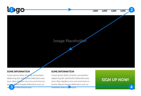
If you want to be very specific, it starts from left to right, and your visitors’ vision follows the “Z” pattern. Brandon Jones of TutsPlus already explained the Z pattern in great detail, and he puts it nicely, this way:
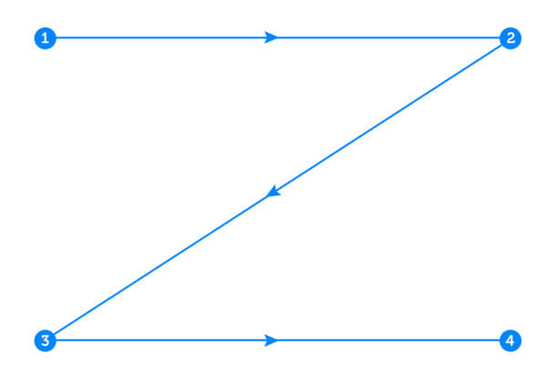
The Z-Layout is a great way to start just about any web design project because it addresses the core requirements for any effective site: branding, hierarchy, structure, and call to action. While the classic "Z-Layout" isn't going to be the perfect solution for each and every website out there, it's certainly a layout that's effective enough to warrant inclusion in any web designer's arsenal of layout ideas.
And…
“The premise of the Z-Layout is actually pretty simple: super-impose the letter Z on the page. Place the items that you want the reader to see first along the top of the Z. The eye will naturally follow the path of the Z, so the goal is to place your "call to action" at the end”
because..
“Attaining a better grasp of how different layouts can change user behavior is one of the central principles of creating an effective user experience”
A Landing page then looks like this:
In our case, it’s to do only “one thing” that you want visitors to do, and that’s to take action of some sort.
Instead of saying something vague like “…of some sort”, let’s cut the chase and come to the point: you only need to get your visitors’ email address.
You can do that by:
- Giving a discount (if you are into e-commerce)
- Letting users subscribe to get access to free samples (digital or physical) or even parts of your digital products (like first few chapters of your book, limited access to your membership site, first few video lessons of your online course, etc.
- Giving away a lead magnet (like a guide, an eBook, a checklist, a secret something.)
That’s it. The hero section of your landing page is built for a purpose. That purpose is to get people to signup.
To do this effectively, you’d need to ensure that you:
- Do not have anything that distracts and sits on the top of the landing page (or anywhere else)
- Have No navigation menus
- Place No social media buttons
- Place No other clickable links
- Put anything on the page that makes no sense
There are no ifs and buts here. I don’t care about what “you” want to put on the hero section.
This is all there for a reason, and that reason is to get you leads and email subscribers.
Now, let’s dig further:
Note: every single decision made for your landing pages should be based on data; not what you think is right. You get this data by letting traffic come through and by doing A/B testing
On the front of Hero section: Image or no image?
When you are looking to create the best landing page design possible, Images are critical. But then, you'd never know if you don't test.
The only kind of images on your landing page (especially on the forefront of the page) have to be those that pertain to the exact thing you are giving away on your landing page
- A snapshot of the cover page of your eBook
- An Intro video that nudges your visitors to sign up
- Your own photo (if it’s done professionally, and I hope you are smiling)
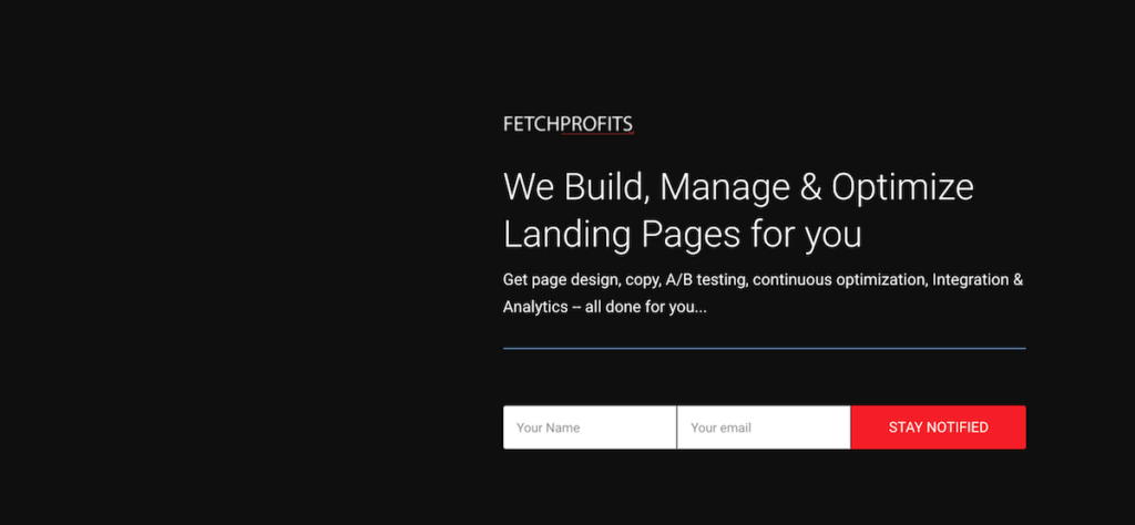
If there’s no such image, don’t use any. In my case, I didn't have any image to put up here since this a pre-launch landing page (and there's nothing there to offer).
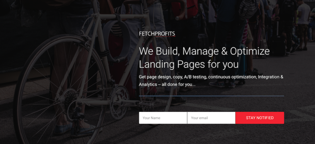
Background image or no background image
You have a bit of a leeway here, with the background image (unlike any images you might put on the forefront).
Again, it’s only a matter of choice, but the ground rules for the background images are as follows:
- Whether or not you should include a background image is something you can find out with A/B testing.
- If you have to use a background image, use one but add an overlay on it – don’t put a background image without an overlay (dark is good)
- Get an image from Pexels.com or Unsplash and make it as close and relevant to your business niche, the offer you are making, or your brand.
- Background videos are even better if you can get one. Again, videos work better as backgrounds or images? The answer lies in A/B testing.
I thought this hero section with people lining up makes some sense (but I have to test this).
Headings, Sub-headings, & Calls to Action
The action center, as I like to call it, has all the good stuff that actually matters: your heading, the sub-heading, and the copy.
Then, you’d have the Calls to action (which could be a form to get email subscribers to sign up or a button to have them click on – this has to go somewhere else).
Before you get anywhere near “The Action Center”, know this:
- Think about what you want to offer before you even get close to building a landing page. Just don’t.
- Keep the offer straightforward and simple. Don’t overthink it. It’s inexcusable if you take 4 weeks just to figure out what to offer.
- If you want to learn how to make offers, download this free copy of The Irresistible Offer by Mark Joyner [Thanks to HubSpot]
- One offer = one landing page. This rule is universal. Don’t offer people to signup to your free eBook, a sample video lesson, and also put a button there pointing to your store.
Once you get the decision about what to offer out of the way, all the copywriting rules apply here. As Joanna Wiebe writes, “cute and clever” doesn’t work as well as a simple, straightforward, and direct copy does, and only rookies write from scratch.
As Joanna Wiebe writes, “cute and clever” doesn’t work as well as a simple, straightforward, and direct copy does, and only rookies write from scratch.
Here’s an ultimate Guide to No-pain Copywriting by Joanna Wiebe
I’ll repeat myself: What’s cute and what’s not? Do funny headlines convert? This headline or that headline? This sub-heading or that one? This copy or that? This call to action or that? This offer or that offer?
The answer: A/B testing. See how some experiments led to some awesome results.
The Mid Section
See, I’ll be honest. For some landing pages, you don’t even need to get this far. For something as simple as a simple one-page PDF which happens to be a “Funnel Checklist” [I do have this as a giveaway], I don’t need mid sections and footers even.
Depending on your use case, you might just need one.
The mid section: Beyond the scroll…
If your visitors look past the hero section, it only means one thing: they need reassurance, clarity, more information, or all the three. That’s why this mid section exists on a landing page: to reassure, to provide clarity, and to provide more information (along with some other good stuff).
This is how a typical mid section looks like:
- Keep it simple but try to provide more information (since the hero section might be too direct and doesn’t usually allow for more information)
- Keep it clean. Use short blocks of content.
- Don’t over do it -- this isn’t your thesis paper. I also don’t care if you are Amazon and have you more than 1,00,000,000 products.
Strike Two. Your second Opportunity
Now, because visitors did scroll past the hero section of the landing page and they did take a gander at some more information (which could also have some social proof, testimonials, product images, or more such info).it’s also a great opportunity to “try” nudging your visitor once more.
It’s also a great opportunity to “try” nudging your visitor once more.
Somewhere there (preferably another section below the main section where you provide information), put up another call to action.
See how it’s done below:
Best landing Page Design: Bringing It Together
There’s an ongoing debate (never dies) about long-form landing pages and short ones. I don’t care. The only “form” of
The only “form” of a page that matters to me is the one that converts and whether or not I have the opportunity to improve on those conversions.
So, if your page has to end here, let it end. If you want to, you can add bits of social proof, testimonials, or yet another call to action here.
If not, just ignore it and end the landing page with a logo.
That’s it. That’s all that should be on your landing page.
The colors, graphics, images, actual blocks on the page, the length of the page, the number of sections, and the calls to action – all of these can be different for different businesses and for different reasons.
But the only thing that can’t vary so much is the variation in “thoughts and opinions” on what is basically so simple and straightforward.
In fact, there should be no place for emotions on the part of anyone building a landing page.
It’s another thing that you should employ awesome copywriting techniques, images, graphics, colors, and everything else on your landing page to invoke emotions (for your visitors).
You can’t have opinions about a landing page, but you build pages that others should have an opinion on (and it doesn’t matter if some people don’t like the page – and they still signup – you see?).
It’s also not about looks because there are butt ugly landing pages that convert like crazy.
How is your landing page shaping up?
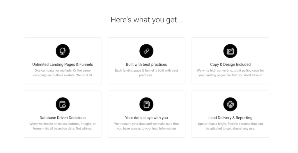
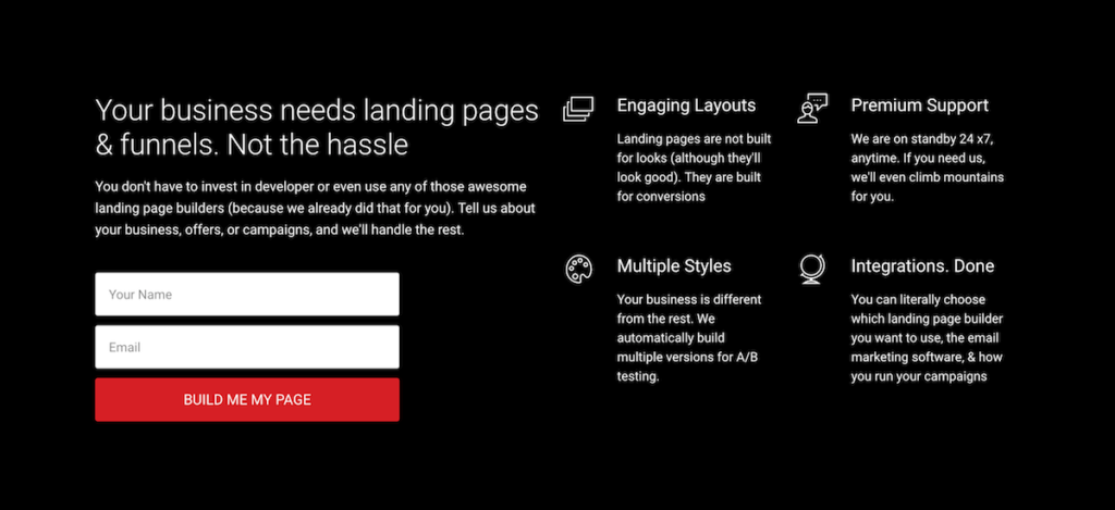
If you need help with landing pages, I am going to launch a dedicated service only to help build, organize, optimize, and manage your landing pages & funnels.
Signup Now to get exclusive offers and discounts for subscribers only
Trackbacks/Pingbacks