B2B Marketing emails — and the B2B marketing email examples shown here — always do a tight-rope walk: Should you be serious and sound all corporate-ish or should you dare write out personalized emails?
I only have two recommendations for using an email marketing system that can help you grow your list and run a sustainable email marketing program. If you have multiple offers (like Content Upgrades) use Drip, ConvertKit, or Mailchimp
If you ever wondered, stop doing it. Just make it personal.
Here are a few high-energy, fun, and fantastic B2B email marketing examples:
Descript: Share Your (Complete) Story
I use Descript App for saving tons of time and for doing some really smart things with audio (not so much) and video (I am trying).
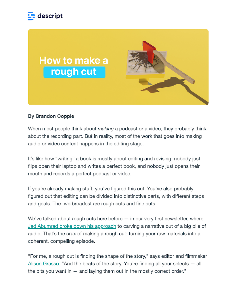
With Descript, you can edit videos (including adding your own voice, just by typing) along with at least 11 other cool things with Descript features most people don’t even know about.
Read:
If you ever wondered whether your email marketing messages should be short or long, Descript’s email marketing messages will make you think again.
Descript sends both short emails and long ones. The short ones are your usual action-based emails or triggered emails based on what you do inside Descript.
The longer emails are for sharing tips, tricks, and hacks to use Descript. Or they share case studies, stories, and inputs from other community members.
DataBox: Product Updates, Done In Style
Databox is a super helpful data visualization tool (primarily focused on digital marketing reports, analytics, and business growth thanks to marketing). With Databox, you can can connect with several platforms and create analytics dashboards to make your data digestible (and honestly lots of fun to look at).
You’d normally connect all sorts of digital properties that your business has a presence on: Say Twitter, LinkedIn, LinkedIn brand page, YouTube channel, and more.
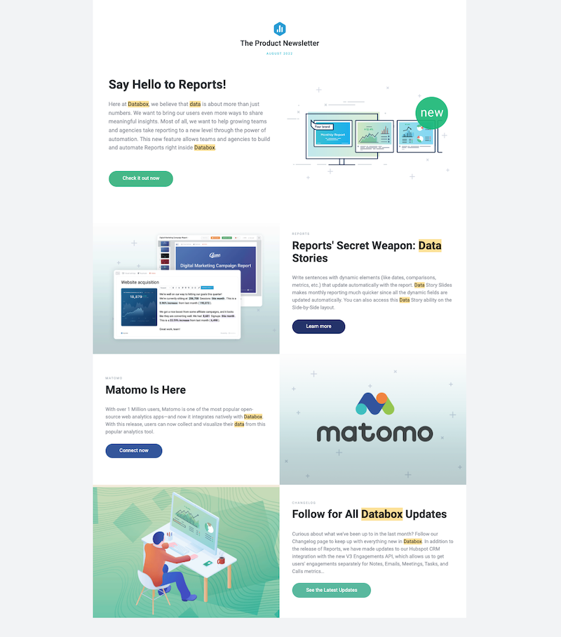
Right out of the box, of course, you also have access to much-needed analytics dashboards for Search Optimization, blogging and content marketing analytics, and so on.
Read:
Databox emails are rich, full-width, and HTML-based. The Databox email example shown here is from one of their recent product newsletters — a healthy, once-a-few-months affair featuring the latest updates for Databox.
Flywheel: Hey there, Good Looking’!
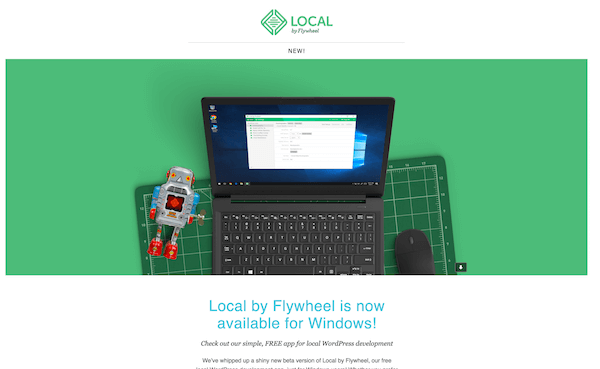
We use Flywheel for our hosting, and it’s amazing how these guys made something like WordPress managed hosting feel so classy.
You’ll always get personalised, short, well-designed and succinct emails from Flywheel.
Flywheel’s emails aren’t too often, and they only send out emails when they have something to say.
Fine by me.
LiveChat: Pound of Goodness In an Email
LiveChat is one of my favourite LiveChat solutions. It’s the best, the largest, and it’s backed by some of the best people out there.
Their emails come in with tons of goodies. Especially those with blog posts that just seem to answer some of the most common problems small businesses always have.
Google Keeps It Simple
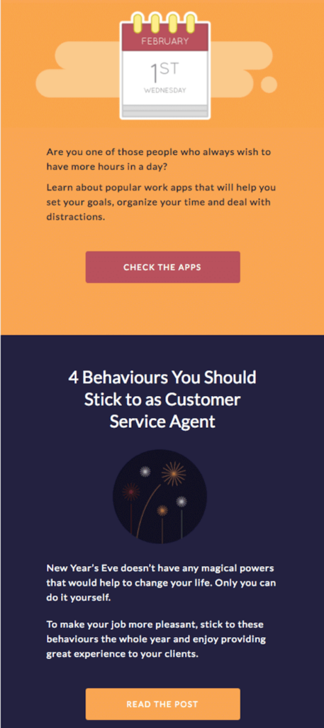
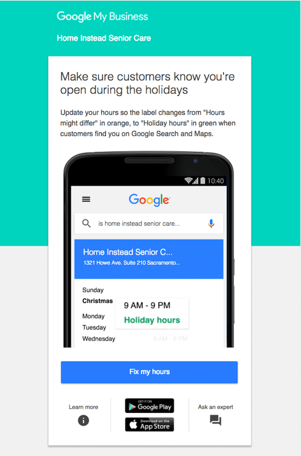
Google’s Suite (earlier Google Apps) has always been focused on on-boarding small, medium, and large-sized businesses. But their emails never come across as too heavy to deal with.
See this Google My Business (obviously written to business owners) email. There’s not a word on that email that’s unnecessary. Practical, smooth, and to the point.
Vero: Learning Vs Selling
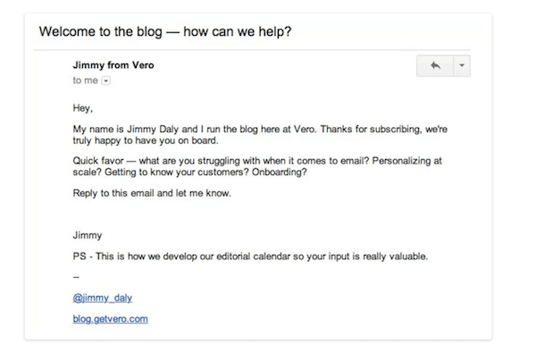
Jimmy Daly of Get Vero did an experiment with a massive 14-step campaign just to welcome new subscribers to the Vero Blog. When Jimmy realised that despite some positive feedback and results, they just nuked the 14 emails in favour of a single one as shown below:
What did that email give the folks at Vero? Thousands of replies, and a possibility to learn and adapt to their users’ needs, and get a deeper understanding of their customers’ problems. The point? Create opportunities to learn, gather data, and get insights before “selling”.
Conversio: Insight Layered + Value
Conversio is an all-in-one ecommerce dashboard. It helps you save more time to run your business by aggregating all the data you need to make decisions to a single dashboard. Abandoned Carts, receipts, follow-ups, feedback, reviews — everything that relates to your ecommerce is on Conversio.
But that’s not what’s awesome. This email example is:
First, Conversion seems to detect that customers are using Yotpo for reviews. Second, this email helpfully lets premium members know that they don’t have to continue paying for two different services.
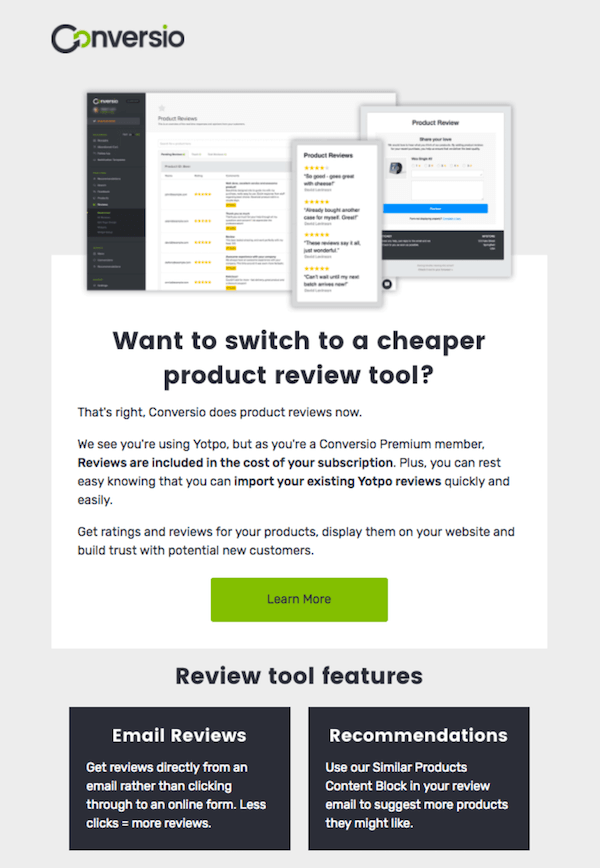
How cool is that? Especially when Conversio could have just danced in the rain after making the sale, right?
GoSquared: Simplicity At Its Best
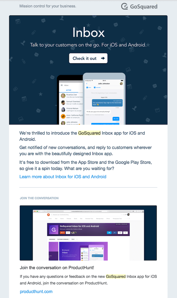
Simple emails are the hardest to write. It’s always nice to get an email from GoSquared with one of their product updates (it’s another thing that I am partly biased because I use GoSquared too).
Loads of simplicity per email, custom graphics, and energy just comes in.
Close.io: Hey You, I am Talking to You
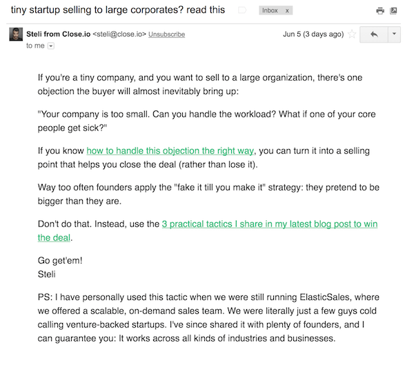
Steli Efti is an inspiration for me. His accomplishments with cold email outreach, the hustle, the energy, and his writing style — I can never get enough of it.
His emails have no fancy graphics except a few photos sometimes. He doesn’t use elaborate HTML headers. His emails are mostly text (with links sometimes).
Close.io meanwhile focuses on selling purely to startups, SaaS companies, and businesses.
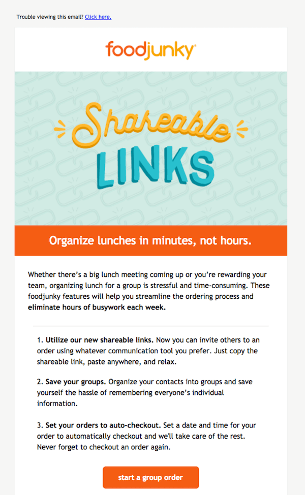
FoodJunky: 1-2-3, That’s it
FoodJunky seems to have a pattern with its effective emails. The company helps businesses manage catering, order food, or arrange for restaurants at the last minute — without HR complications.
If you see their emails, they like to do the step-by-step thing. You know? 1-2-3 and there you go.
Moo: Share Excitement + Teach
Moo is a company that helps makes businesses get access to premium designs for business cards, post cards, and stickers. Plus, they have oodles of character (and that’s something else).
They didn’t miss a little bit if helpful fun in their email campaigns though.
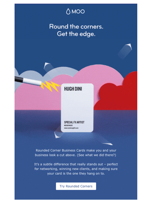
See what they did there?
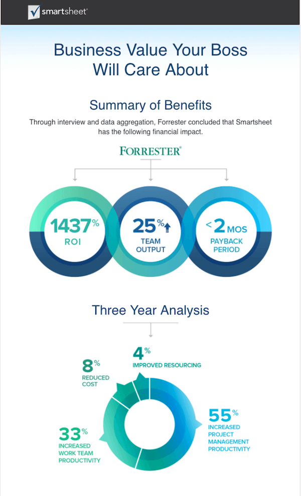
SmartSheet: Value Delivered, In a Snapshot
Smartsheet helps your business manage and automate collaboration. It allows businesses to use high-value solutions and rich data along with providing everything a business needs for compliance and data management.
Did it go over your head already? Wait, their email makes it much easier to understand.
Singular emails with valuable insights shared as an emailgraphic (Call it whatever).
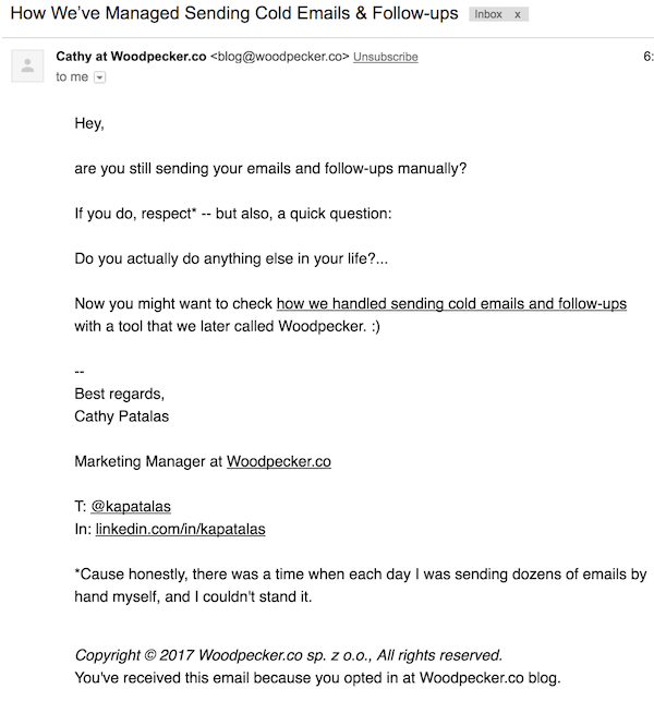
Woodpecker.co: The No-Sale Email
Woodpecker.co is an awesome tool that can help streamline your cold email outreach efforts. It puts everything you do with Cold email outreach in a single place, allows for automated follow-ups, and provides you with analytics that’ll tell you how well your cold emails are working.
Their emails come without the busy images, if ever. All that they do is share information. Then, some more information. I am yet to see an email from them that says “Sign up”.
Is that good or bad? You tell me.
Do you have any awesome B2B email marketing examples that you can share? I’d be thrilled to hear from you. Please comment below.

Trackbacks/Pingbacks