Your landing page has a singular goal: get leads. That wasn’t hard, was it? But landing page faux pas -- you'd do it or others will do it for you -- is holding all that potential back.
What’s hard is the work that goes behind-the-scenes to make your landing pages work the way they should. The toil, the labor, the art, the creativity, the copy, the designs, the graphics -- it’ll all matter.
That’s why landing pages aren’t just something you’ll create and throw into a campaign. They are a labor of love leading to specific results.
To get something specific, you’d have to start with something specific -- like a specific goal, a specific offer, a specific agenda, and a campaign that targets a specific kind of customer persona.
There’s just too much vague shit going on with marketing that you should not follow.
Here are some principles that’ll make your landing pages work harder, avoid landing page faux pas and get you the results you seek:
Linking to a website Home Page (or use other links)
You might think you know this already. Many businesses (even freelancers, agencies, and digital marketing specialists) don’t know this. Or at least, they care less.
There’s a reason why we are so passionate about landing pages, and the reason is this:
Here’s an ad (SEO people?):
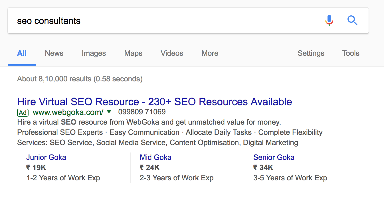
This is what the ad points to:
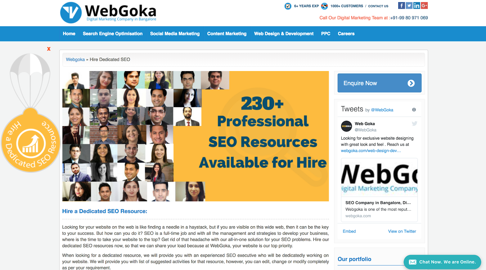
Landing pages exist to free you from making this blunder. Pointing to your websites is an absolute no-no.
It’s a crime.
It’s a sin.
You are a criminal if you do this and you don’t have the right to advertise. You can hate us all you want but we’ll stick with this, regardless.
Looks don’t matter as much. Stop fussing about it
This butt ugly landing page, thanks to folks at KlientBoost converts like crazy (54%):
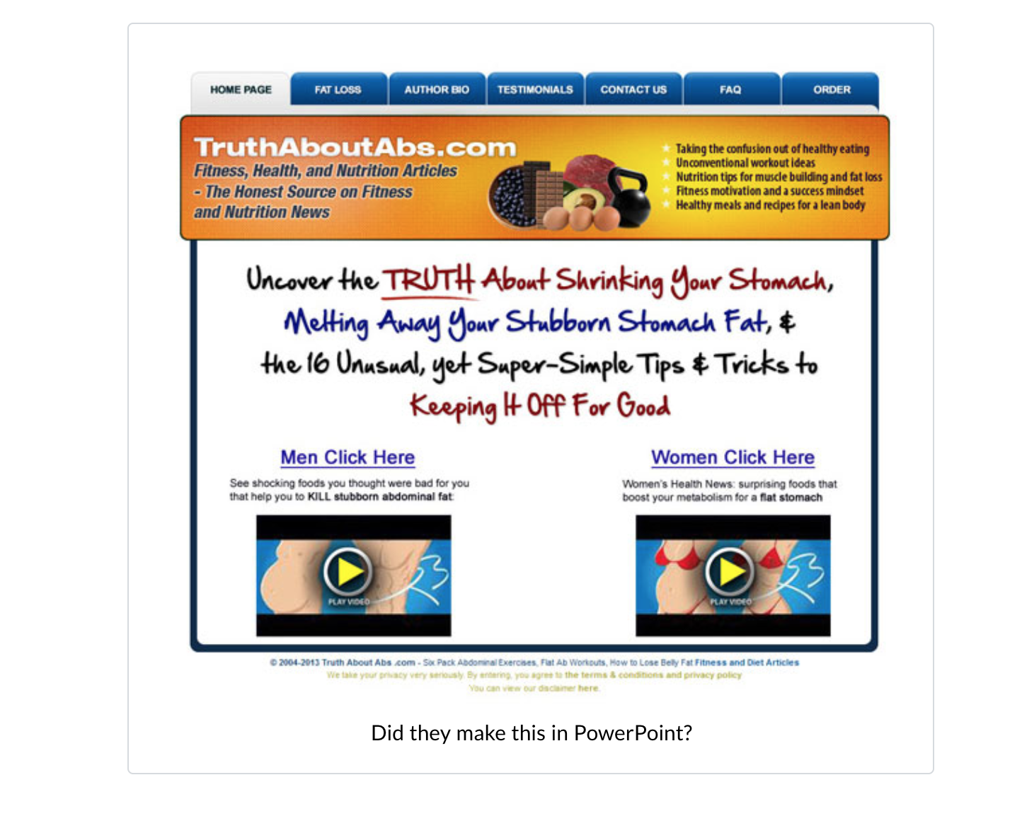
Landing pages aren’t websites. Landing pages are not built for “drooling over”.
No one cares about your colors, your brand, your logo, the fancy custom graphic that you had someone on Fiverr design for you.
You aren’t building your landing pages because you hope to win Awwwards. You don’t want your visitors to say “wow” and exit the page. You’d care less if your page was ugly as a rat’s butt but can still convert at 40% or more.
Too many of us judge landing pages by the way they look. But then, as Mattias Guilotte of Unbounce points out, Ugly landing pages convert.
Stop doing that mistake. You’ll be forgiven for building a landing page that looks ugly but converts.
You’ll never be forgiven for “no conversions. ”
Use Two, large, simple fonts Max

Stick to a maximum of two fonts -- one for headings and one for the body copy. Pick any two fonts but don’t go beyond it.
If you are using Helvetica as headlines and Lato for body copy, stick to it. Don’t bother experimenting with fonts because you’ll ruin the visual appeal of the page. Plus, it’s easier to use two fonts than “many”.
Inconsistent typography is a deal-breaker and it’ll break your bank sooner than you think.
Read more:
12 Best Typography Plugins for WordPress
Build landing pages with clarity
We are marketers and we do the mistake of using superlatives even without knowing that we are using them.
Writing things like “exclusive”, “the one and only”, the “World’s #1 whatever”... the list goes on.
For one, be a little choosy about these superlatives since they stopped making a difference to the customer psyche a long time ago (maybe we didn’t get the memo).
Don’t get fancy with copy. Opt for clarity instead. Specify what your visitors get and why you are special. Focus on benefits and let the features wait.
Read More:
34 Great Landing Page Examples You Gotta Save for Your Swipe File
The Ultimate Guide to landing pages
Follow the No-links Policy
If it’s a landing page, you can’t have links in there. No navigation menus. No images that are clickable. Absolutely no social media buttons (you have a choice of having those social buttons on the pages that show up after someone signs up as a lead -- like a thank you page).
Sometimes, you might want to make extra information available for some elements on your landing page, such as:
- More information about a property listing for a real estate landing page.
- Details about actual work done for a client you are showing as proof of work or as a testimonial.
- More information about a product.
In any of the cases where you’d need to show more information, use a button that opens up a lightbox with that information thrown in.
If you must have links, they should not let visitors go away. Have them browse through extra information while they are “ still on the page” using lightboxes or click-trigger pop-ups.
Read More:
How to Design landing pages that convert
7 Practical Ways to Use Landing Pages to Boost Conversions for Small Businesses
No Pop-ups, Slide-ins, Pop-outs, and Pop-unders On Landing Pages

On your landing page, the only thing that should pop is the Call to action -- the one thing you’d like your visitors to do.
Pop-ups are awesome by themselves (and that’s why we sell them too) but you can’t have a pop-up on a landing page. You obviously also can’t have something that slides in or pops out or pops from under there somewhere.
Don’t even bother with live chat on your landing page (that’s meant to be on a much more engaging web property like a website, you see?).
On your landing page, visitors are meant to arrive and take action. Not sit there, lounge, think, discuss, and chat.
Read More:
10 Inspiring Exit Intent Pop-up Examples To Increase Your Conversion Rate
14 Inspiring Popup Design Examples to Help Grow Your Online Business
8 High-Converting Lead Generation Landing Page Examples to Inspire Yours
Say no to Big ass forms; Short forms are winners
Unless you are selling something that requires a massive input from your visitors (which is never), short forms always work best.
The shorter the forms are, the better your conversions are going to be.
Think carefully about what you are asking and why. Don’t ask for anything you don’t need from your visitors.
If you sell online exclusively, you don’t need form fields such as “phone number”, “address” etc. If you sell locally and if you have targeted campaigns focusing on a single demographic location, you don’t need to ask for “location”.
Read More:
63-Point ✅✅✅Checklist for Creating the Ultimate Opt-in Form (with Examples)
How To Create Mobile-Friendly, Responsive Forms ℹ️ for Easier Engagement
Sounds obvious? It's really not. Even if it is, several business owners and marketers don't even have landing pages to begin with.
Create awesome landing pages -- without the landing page faux pas -- using the following tools and avoid the need to wait for designers (who shouldn't even be getting anywhere close to your landing pages at all).
What are some of the landing pages Faux Pas you can think of?