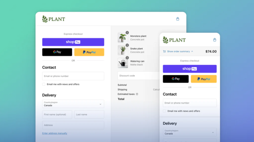
Shopify just rejigged its already incredible checkout. The new Shopify One Page Checkout is now more stable, faster, intuitive, and it’s all on “one page”.
See what’s new with the world’s best checkout now.
Much like the Shop Pay, One page checkout is a streamlined checkout process that allows customers to complete their purchases on a single page. This is in contrast to traditional multi-page checkouts, which require customers to navigate through multiple pages in order to complete their orders.
According to the folks at Shopify,
“…Our new checkout experience will be able to recognize buyer information on pre-checkout touchpoints like storefronts or social media, and handle these partially known buyer cases by pre-filling in details, auto-collapsing and accelerating buyers wherever applicable.”
One page checkout has a number of advantages over multi-page checkout, including:
- Improved conversion rates: One page checkout is faster and easier for customers to use, which can lead to improved conversion rates.
- Reduced cart abandonment: Shopping Cart abandonment is painful. One page checkout reduces the risk of customers abandoning their carts before completing their purchases. This is because customers are less likely to get frustrated or give up if they can see the entire checkout process in front of them.
- Improved customer satisfaction: One page checkout provides a more seamless and user-friendly checkout experience for customers. This can lead to improved customer satisfaction and repeat business.

How to create a one page checkout
If you are interested in implementing one page checkout on your ecommerce website, there are a few things you need to do:
Choose a platform that supports one page checkout: Make it easier for yourself and go for Shopify. But there are likely to be similar ways to optimize checkout pages and build something similar to Shopify one page checkout on other platforms that support one page checkout such as WooCommerce and Magento.
Design your checkout page. When designing your checkout page, it is important to keep the following in mind:
- Make sure the page is easy to navigate and understand.
- Place all of the necessary checkout fields on the page, such as billing and shipping addresses, payment information, and shipping options.
- Use clear and concise language. If required, support multi-language stores.
- Use high-quality visuals, such as product images and trust badges
Test your checkout page. Once you have designed your checkout page, it is important to test it thoroughly to make sure that it is working properly. Test it with different browsers and on different devices.
Tips for optimizing your one page checkout
Here are a few tips for optimizing your one page checkout:
- Reduce friction: Don’t ask for anything you don’t need (unnecessary questions, extra form fields to fill up)
- Use a progress bar. A progress bar can help customers to see how far along they are in the checkout process and to stay engaged.
- Offer guest checkout. Guest checkout allows customers to complete their purchases without having to create an account. This can be convenient for customers who are making a one-time purchase.
- Offer multiple payment options. Offer customers a variety of payment options to choose from, such as credit cards, debit cards, and PayPal. This will make it more likely that customers will be able to complete their purchases.
- Use social proof. Social proof, such as customer reviews and testimonials, can help to build trust with customers and encourage them to complete their purchases.
- Add Subscriptions: If it makes sense for your products or services, be sure to add subscriptions. For Shopify, there are tons of Shopify apps for Subscriptions. Some of the best eCommerce brands are riding that subscription wagon to profitability. Are you?
- Tap into the power of BNPL (Buy Now Pay Later): Give your customers options. There are now tons of ways to pay (across the world). Read more about BNPL and eCommerce trends that changed while you were sleeping.
Read More:
Mobile eCommerce Checkout Optimization: How GoPro Does It
12 Customer Retention Strategies You Should Implement Today
One page checkout is a great way to improve the checkout experience for your customers and boost your conversion rates.
By following the tips above, you can create a one page checkout that is easy to use, secure, and effective.
Tried out Shopify One Page Checkout yet? What do you think?
Tell me all about it on Twitter, LinkedIn, or my LinkedIn Brand page.
