Home page design is often ignored. But you shouldn’t be. Good home page design doesn’t just make good impressions. In most cases, it makes good coin as well.
Pretty looking pages score on “looks” but might not score on “conversions”.
Most times, simplicity wins.
Even boring and ugly can do better than anything fancy.
Yet, there are ways you can design landing pages that not only look great but also convert well. In fact, it’s amazing when everything — design, copy, colors, elements, animations, and the CTA — just clicks.
There are several examples of landing page designs that are beautiful to look at, a treat for the eyes, and they are all built to convert. Here are some of them and why we think they are awesome:
Studiopress
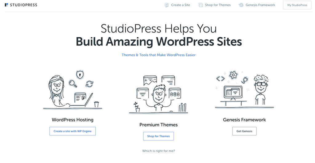
Studiopress, for a long time now and that still continues, has had the world’s best WordPress themes. Clean, minimalistic, and minus the bloated code you’d normally find in other WordPress themes.
Studiopress runs off the popular Genesis Framework for WordPress.
Also download and read: The Genesis Guide for Absolute Beginners
Read: Why Genesis Is the Foundation of Any Smart WordPress Design
But that’s not why I am writing about Studiopress today. It’s because Studiopress’ homepage is an absolute gem. It’s a machine that converts like crazy. So much that it’s been instrumental in making Rainmaker Digital Services Inc what it is today.
It’s so good that WPengine decided to own Studiopress right away.
Studiopress will now be offered for free for any WPEngine Hosting Plan you’d pick.
Wistia
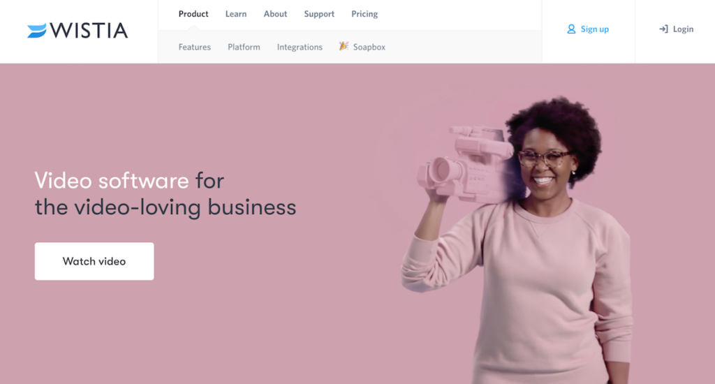
There isn’t anyone who doesn’t know Wistia (or maybe there are). The point is that Wistia puts in a lot of work on its homepage (and every other page).
Wistia also has an offer you can’t refuse. Start for free (up to 3 videos).
Each of those pages is packed with value as long as it’s about creating videos, using videos for marketing, or for using video for branding, lead generation, customer support, online courses, or whatever else you might use video for.
Wistia provides you with everything you need to host your videos, use videos for marketing or lead generation, and Wistia integrates with tools like Hubspot (and others) to help you complete that digital marketing loop.
If you aren’t using Wistia for your business (hosting, marketing, business support), you should.
Leadpages
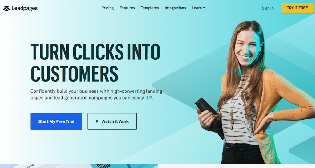
Landing page builders have their work cut out for them. They not only have to work on creating the best landing page builders they could build but also prove a point (sort of).
Their own home pages better convert, right?
Leadpages has it going well for itself, especially with its home page. It stretches across your screen — complete with one pretty lady and two huge call to action buttons. That four-word headline is pure genius if you ask me.
One of those CTA buttons have the web’s all-time favorite: Start a Free trial.
Need proof if Leadpages Homepage works?
Visit Leadpages, stay there for a while and look out for little pop-ups that tell you just how many people subscribe to Leadpages by the minute.
ConvertedU
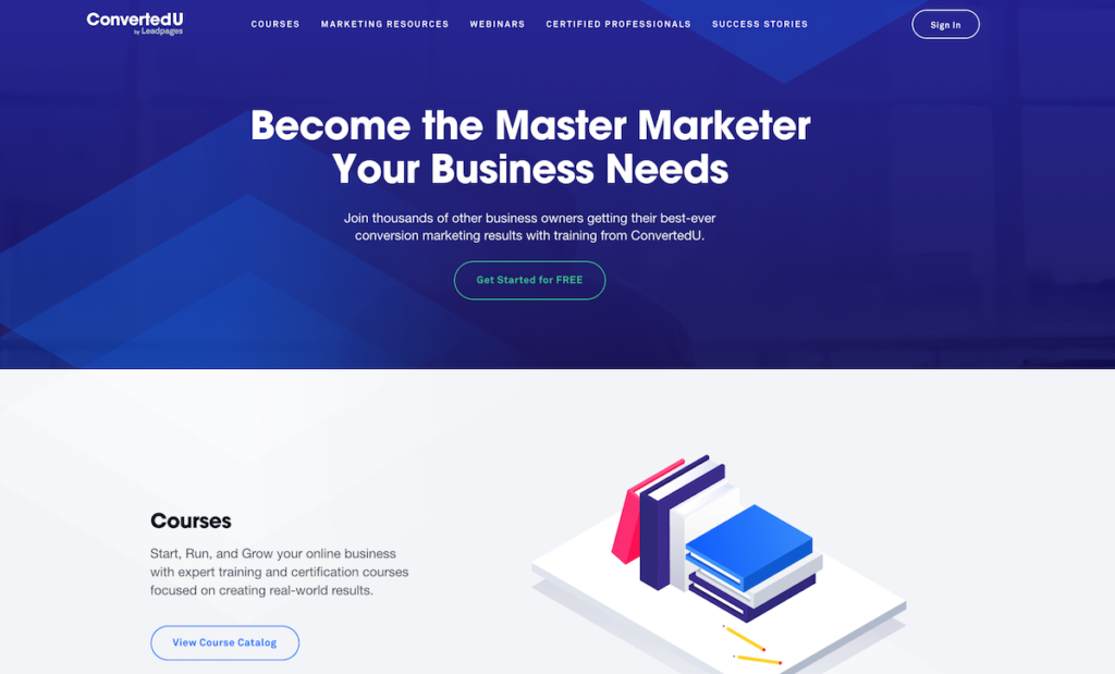
ConvertedU is a classic case study of an online course or resource center done right.
That blue background is striking with an appealing headline (Who doesn’t want to be a master marketer, right?).
Featuring some incredibly awesome courses on landing pages, marketing automation, email marketing, and also including a Drip Certification program, ConvertedU is a premier online resource center or academy that you should check out.
Webflow
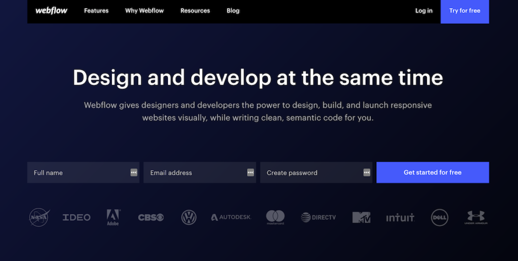
What can a home page of a business (which is designed like a landing page do)? A lot, if you ask us. Webflow has been growing in popularity as a great alternative to WordPress, Squarespace, Wix, and several other web builders.
Webflow is a website builder and CMS (with hosting included) that seeks to help you build super-fast loading, beautiful, and lean website with clean code. The builder gives you complete control over how you build and display web pages.
Webflow’s stunning design, a mega menu, a clear headline, and a subheading that really helps you understand what Webflow is all about.
It also helps that they have social proof (logos) right underneath the main CTA (Call to action). The home page design is built to do just one thing: get new sign-ups by providing a free forever Webflow account.
Does it work? You can bet.
Confrere
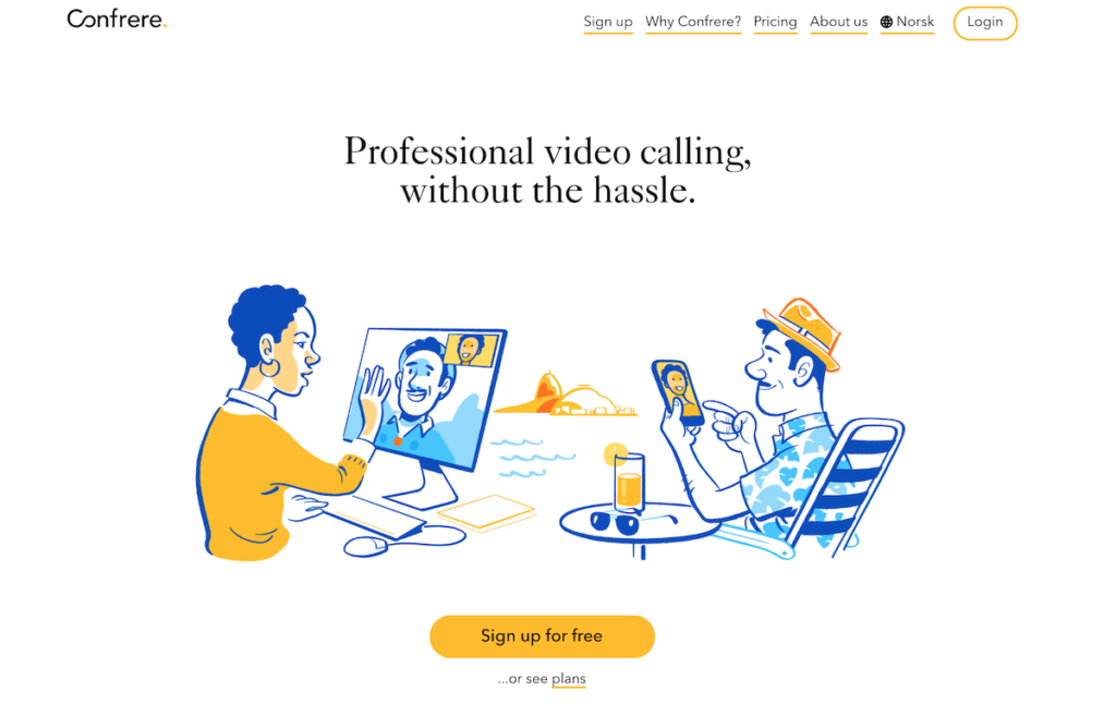
Clean, minimalistic, and on-brand — that’s the flavor of new-age landing page design. Although this is a home page for Confrere — a professional video calling and management service, it has all the right ingredients to make an impact. More importantly, it’s built to convert.
The simple headline conveys exactly what Confrere is all about, illustrations using the brands’ colors (while making it really attractive and pretty), and a call to action button you can’t miss (even if you wanted to) that says “sign up for free”.
If you stripped away everything else on their website and only used the home page, they’d still get conversions (new sign-ups for their free plan).
Captiv8

Say hello to focused landing page styled home pages with a fine balance between content and calls to action.
Captiv8 not only uses headlines and subheadings as we’d all normally do but they also aim to educate — albeit in a few lines as much as possible before dropping a terrific (and relevant) call to action.
Using a simple slider (for once, sliders have some use after all), Captiv8 drops several calls to action (around 3 of them), instead of just one.
Talk about maximizing space for conversions, eh?
Bubble
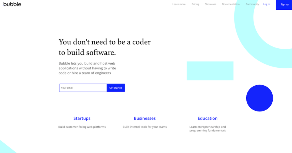
Bubble is what you get when visual programming comes of age.
At a time when you have an “app” for everything, why shouldn’t you have an “app” that helps you build “apps”?
Bubble is a tool that helps you to build apps without code. If bubble had a little more reach than it has now, Andreessen Horowitz’s words “Software is eating the world” could truly have a louder ring to it.
The home page you see on Bubble now isn’t what it used to be. It’s changed, and it’s changed for good.
So much that it does a terrific job of bringing in all those curious cats who want to try their hand to give their product ideas some shame and to see if they can really build a complete, functional app (or at least an MVP) by using nothing but Bubble (and a few other tools within the stack).
What are some of your favorite companies that do a great job with their home pages, landing pages, and other pages to allow for maximum conversions?

1 thought on “Home Page Design: 8 Examples That Are Killing It”
Comments are closed.